The 9 Instagram post reach metrics you need to know
Reach is a crucial metric to track for success on Instagram, but did you know there are 9 different types of reach metrics you can track? With reach graphs specifically related to your posts, stories, profile, ads and benchmarks, Minter.io empowers you to gain more reach without any of the guesswork. In this article, we’re going to look through the 9 Instagram reach graphs specifically related to your Instagram posts.
Posts section on Minter.io
Your posts on Instagram includes your photos, carousels and reels. By tracking and understanding the graphs related to reach in your posts section, you can determine the types of posts that gained the most reach for your content, specific days when reach peaked and dipped and whether your reach has come from people who follow or don’t follow your profile.
Reach
The reach graph shows the number of times posts were viewed by unique accounts during the selected date range and considers all the posts published directly to your profile. Therefore it doesn’t matter when you published a post, if it gained reach within your selected time frame, you’ll see reach across all the posts on your account. This includes photos, carousels and reels split into reach of followers and non-followers of your profile. Above the graph shows the average amount of reach per photo, carousel and reel.
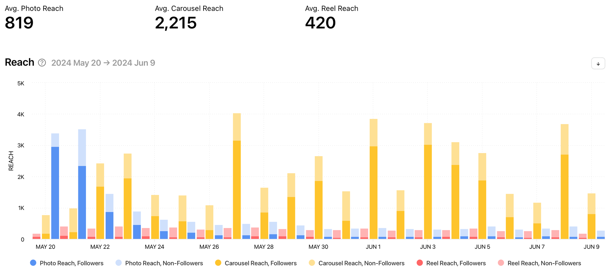
The data is split into content types (photo reach, carousel reach and reel reach) and is colour coded to help you easily pick out which content type(s) gained the highest amounts of reach for your posts within the selected date range. The data is also split into followers and non-followers. This helps you understand where your reach is coming from. When your content is reaching non-followers, this is a good indication that Instagram is pushing your content to users that are new to your brand or who are yet to follow your account. High reach amounts from followers of your profile can be an indication of loyalty and interest from your current audience.
Reach Rate
The reach rate graph shows the average reach rate of posts on the given day during the selected date range. This is the percentage of followers who saw your posts. Above the graph shows the average reach rate percentage and the maximum reach rate percentage with the date this reach rate was achieved.
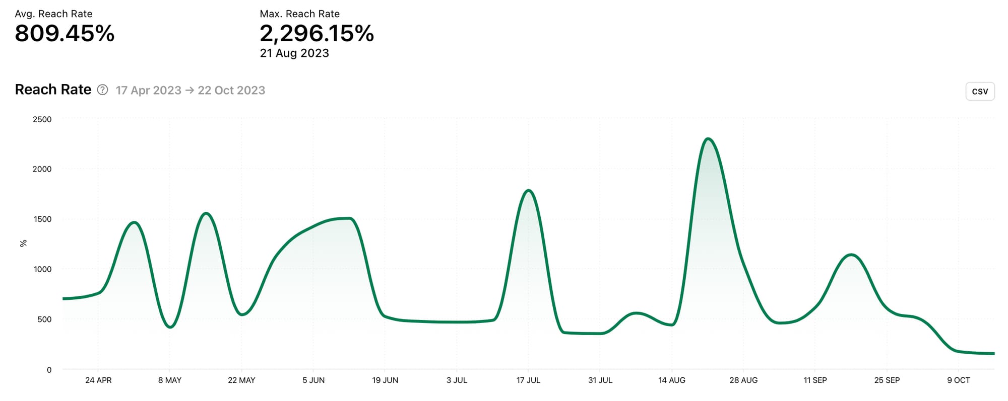
It’s good to take note of the percentage of followers who are seeing your posts as this can be an indication of whether your followers are viewing and engaging with your content, prompting the algorithm to show future content to your current following. A percentage over 100% suggests that your content is being seen by users beyond your followers, which is a good signal that Instagram is suggesting your content to new people. In this case, the next step would be to determine how to get non-followers to click the follow button and join your audience.
Notice the peaks and dips in the reach rate graph. Use the spikes in positive data to find content published on specific days in order to replicate elevated reach. Dips in the reach rate could lead you to find content that didn’t work as well for your brand.
Engagement Rate by Reach
The engagement rate by reach graph shows the sum of all likes and comments divided by reach and the number of posts on a given day during the selected date range. Engagement rate by reach is the percentage of unique accounts reached that interacted with your posts. Above the graph shows the average engagement rate by reach percentage and the maximum engagement rate by reach percentage with the date this engagement rate by reach was achieved.
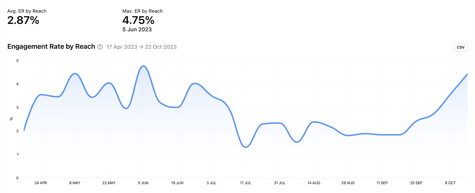
Engagement and reach often work hand-in-hand. When the Instagram algorithm is shown positive signals that users are engaging with your content, particularly if engagement is higher than usual soon after publishing, your content is more likely to be shown to more users, resulting in higher reach. This can create a snowball effect if engagement continues to grow when the content is served up to more people. By being aware of your engagement rate by reach, you can find content that triggers the positive cycle of higher engagement and higher reach - a partnership designed to flourish.
Individual Posts on Minter.io
When you’ve got a good overview of your Instagram reach and the split of reach within different types of content, you might want to delve into individual posts to get a really good look at the content that is performing best. By finding your content with the highest amounts of reach, reach rate and engagement rate by reach, you can replicate and rinse for elevated reach on repeat.
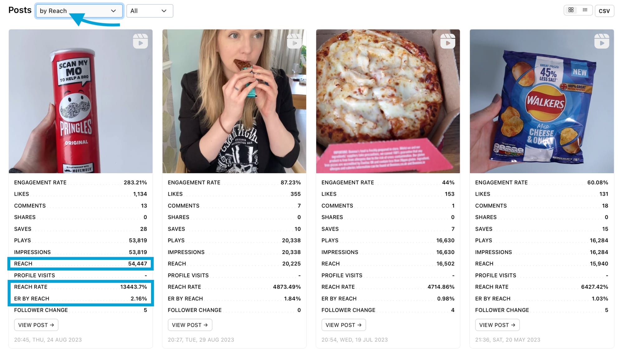
Sort all posts by reach, reach rate or engagement rate by reach. Each individual post also has reach metrics displayed.
72 Hour Data
Select a specific piece of content to view reach 72 hour data, which shows the amount of reach a piece of content gained each hour from the time of publication.
72 hour data gives you clear insight into how well your content performed soon after publishing, which is key in understanding how the algorithm responded to your content. If reach and engagement levels are high soon after publication, this gives the algorithm positive signals to serve up the content to more users, boosting reach in the process. Pay attention to the 72 hour data graphs on your highest performing content to see how your reach grew and if there was a specific drop-off point.
Ads section on Minter.io
Turn to the ads section of your Minter.io account to view reach data relating to your paid-for posts. This is a separate place from organic posts so you can find the data for your ads in one place. By tracking and understanding the graphs related to reach in your ads section, you can determine the specific days when reach peaked and dipped, whether your reach has come from people who follow or don’t follow your profile and how engagement on ads has affected your reach.
Ad Reach
The ad reach graph shows the number of times ads were viewed by unique accounts within the selected date range. Ad reach data is split into followers and non-followers of your account. Above the graph shows the maximum reach with the date this reach was achieved, alongside the average reach.
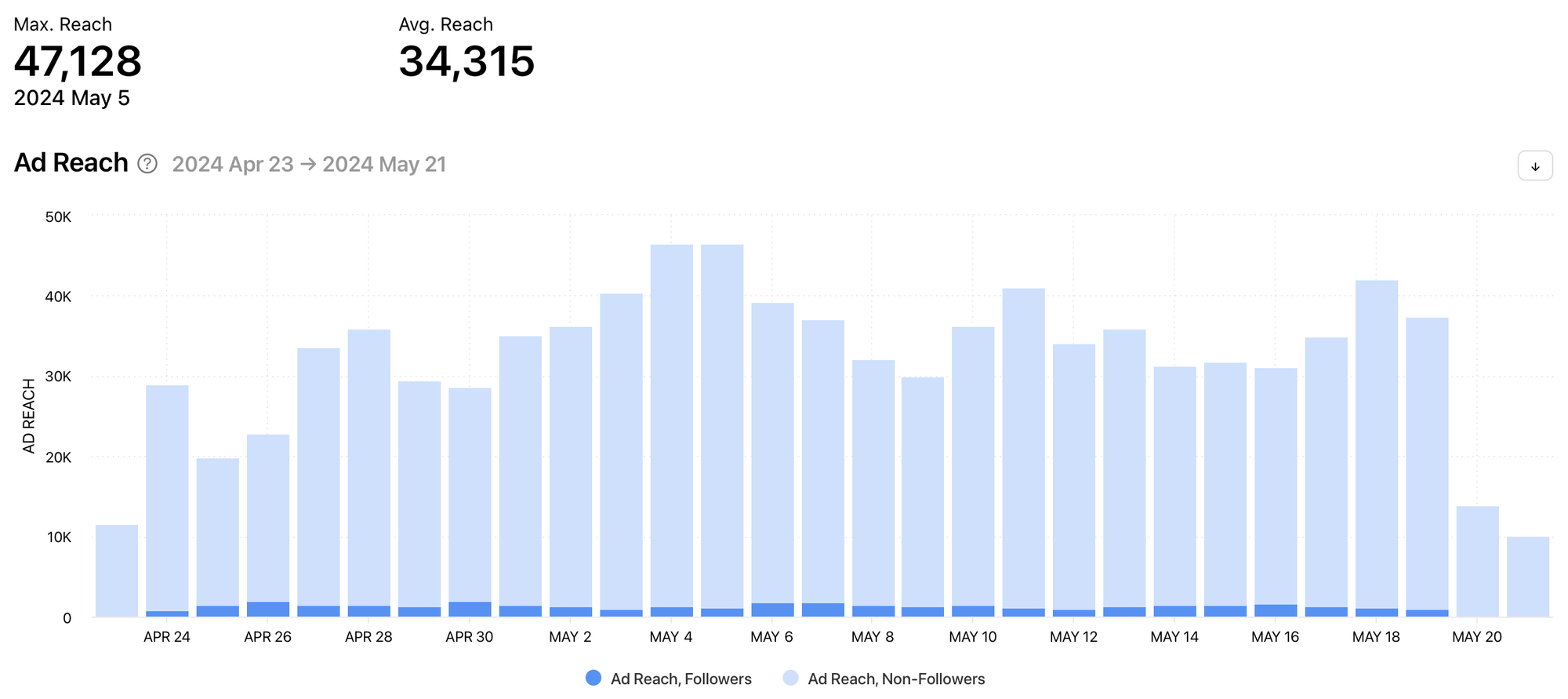
See exactly when ads gained the highest amount of reach and whether reach came from mostly followers or non-followers. Your ad spend, placements, targeted audience, duration and number of ads can all have an impact on your ad reach. Pinpoint days when ad reach was at its highest to determine what was working well for your ads which resulted in elevated reach.
Engagement Rate by Reach
The engagement rate by reach graph shows the sum of all likes and comments divided by reach and the number of ads on a given day during the selected date range. Engagement rate by reach is the percentage of unique accounts reached that interacted with ads.
As mentioned in the posts section of this article, engagement can have a very positive effect on reach. However, this graph also helps you know whether the amount of reach is resulting in a response from the audience of your ads. Are users going beyond just seeing your ad and choosing to engage with a like and/or comment? The engagement rate by reach graph goes beyond reach as a metric on its own and combines it with one of the most useful metrics for understanding and elevating reach.
All Ads
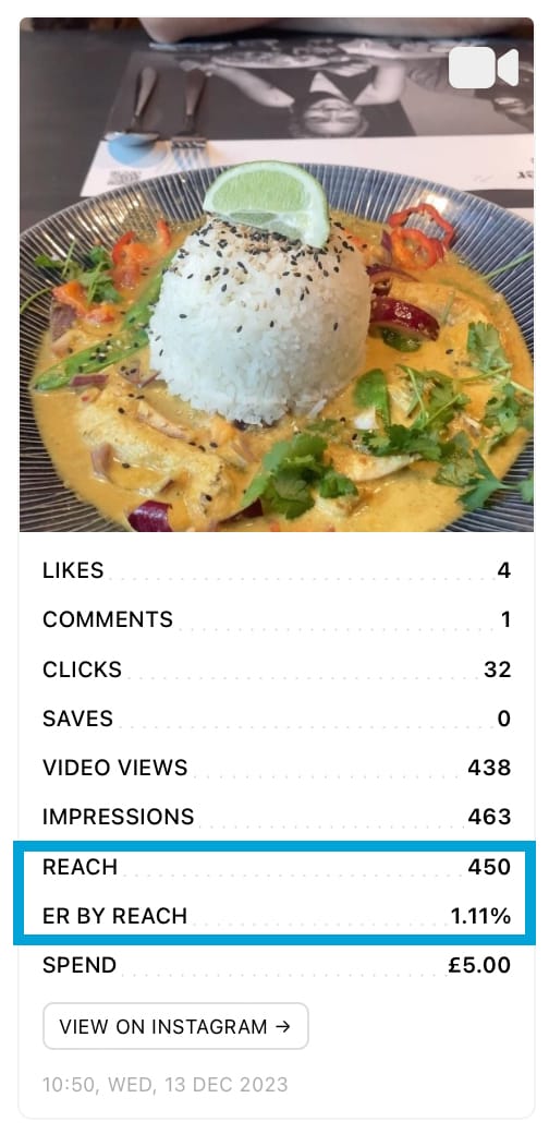
Sort all ads by reach or engagement rate by reach. Each individual ad also has reach metrics displayed.
Profile section on Minter.io
The profile section of your Instagram data on Minter.io is different to the post section as it combines your post, stories and ad data to get an overview of how well your reach is performing overall. By tracking and understanding the graphs related to reach in your profile section, you can determine how much reach your content gained as a whole, on specific days and whether your reach has come from people who follow or don’t follow your profile.
Profile Reach
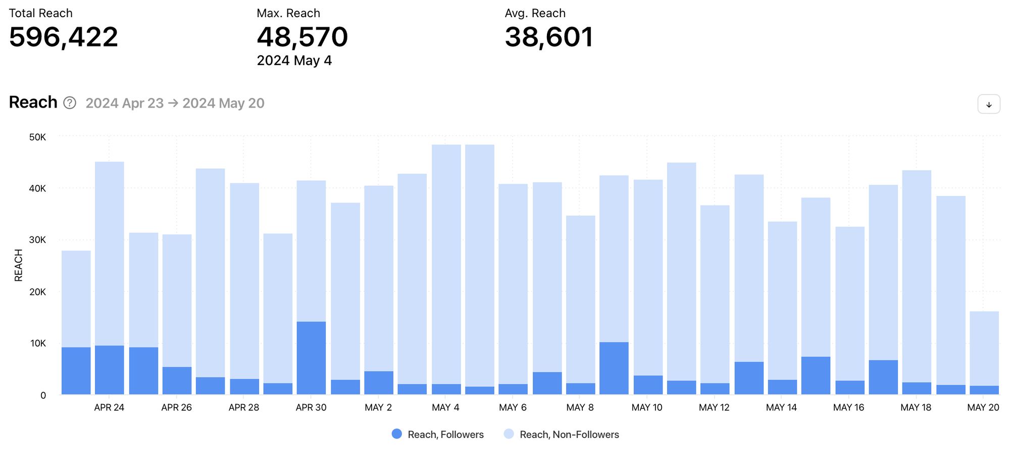
The reach graph shows the number of unique accounts that viewed posts, stories and ads during the selected date range. Reach data is split into followers and non-followers. Above the graph shows the total amount of reach up to the last 30 days, the maximum reach with the date this reach was achieved and the average reach.
Reach Distribution
The reach distribution graph shows the percentage of followers and non-followers that viewed your posts, stories and ads during the selected date range, up to the last 30 days.

Learning about where your reach is coming from can give you a clear indicator of how Instagram’s algorithm and connectivity functions are working in regard to your profile as a whole. It can also show whether your current audience is being served up your content. If your content is reaching non-followers regularly but your following isn’t increasing, it’s probably time to look at how you can turn casual viewers into loyal brand enthusiasts.
Benchmarks section on Minter.io
Benchmarks provide you with a clear guide as to the areas that might require your attention, by providing a simple comparison with accounts of a similar size. This is a useful tool for determining whether your content is underperforming, is about average or is excelling in regard to reach. In the benchmarks section of your Minter.io account, you can see whether your reach levels are in the lower, median or upper sections of your cohort.
Reach Rate per Post
The reach rate per post graph shows the average reach rate per post compared with other Instagram accounts in this cohort.
Are your posts landing in the lower, median or upper area of the reach rate per post graph? If your content is near the lower bar, consider focusing on improving your reach rate per post. This could involve using connectivity functions, focusing on the quality and consistency of your posts and aiming to boost engagement in order to boost reach.
Knowledge is power and with Minter.io you unlock even more knowledge for a powerful boost in business on social media. Discover your business strength with the analytics tool determined to help you level up your reach online. Try it today!
Try Minter.io today! →


