Set your Facebook page up for success
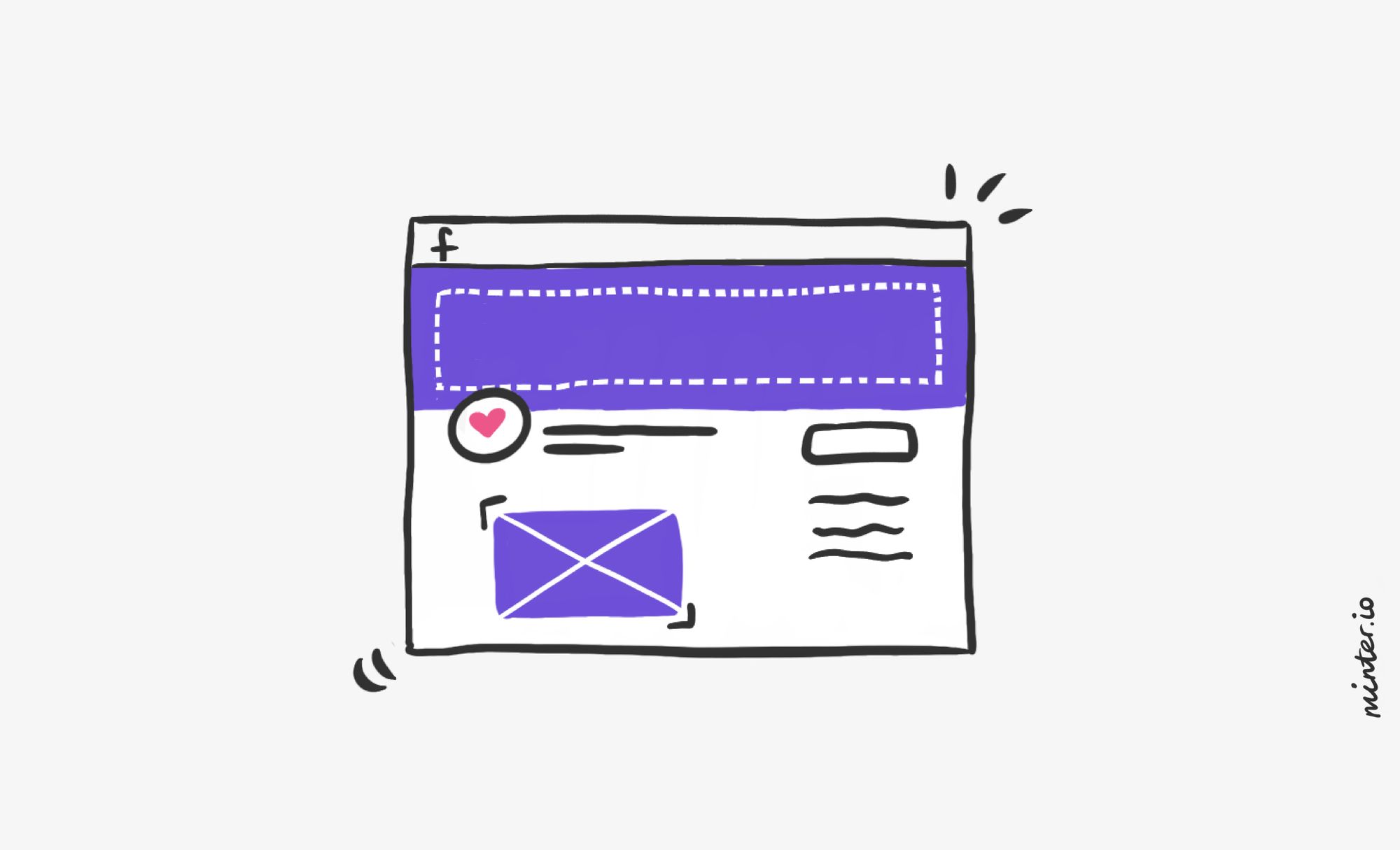
Make your brand pop upon first impression by getting the basics right. When someone hears about your brand, sees your advert or attempts to find you online, one of the first logical places to look is your social channels. These channels provide social proofing, build trust with the consumer and share more than you can get across in traditional media. Potential customers can find information quickly on Facebook pages such as: opening times, website information, telephone number, email address, brand ethos and more.
By getting the basics right with your Facebook page, you can convey a huge amount about your business without saying a word. What is your Facebook page currently saying to viewers?
Get The Basics Right
Clear, Captivating Imagery
What is the first thing you notice when you go on a Facebook page? High quality imagery draws the attention of the eye and gives the viewer a sense of the business and what else they can expect from the Facebook page. By having clear, captivating imagery you are conveying a lot about your business beyond what the imagery literally is. You are showcasing that you take pride in the appearance of your business and have taken care and thought over what you are showcasing on your Facebook page. Don’t overlook how much your imagery says about your brand.
Profile Photo
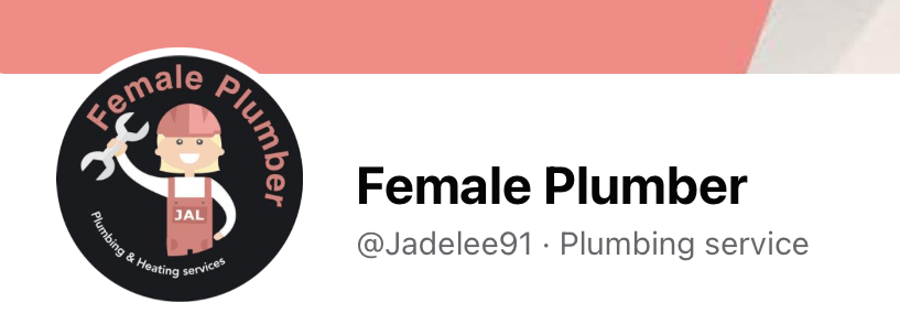
How can you best show what your business does through one image? This is a great way to approach the profile picture. Think of it as though your profile image is a visual advert for your Facebook page. Many businesses opt for placing their brand logo as the profile photo, while it is advisable for lesser-known brands to grab attention with a bold, clear image showcasing what they’re all about. Whatever you decide, be aware that the profile picture is small and circular, so it should be clear, bold and make the most of the available space.
Check out these profile images. Do you know what you’re likely to get when you click onto their pages?



Banner Imagery
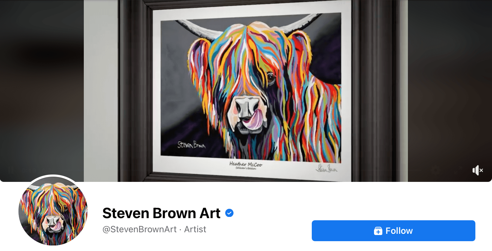
Once a viewer is on your Facebook page, your banner imagery gives you a lot of space and options to make a whopper of a first impression. Your banner doesn’t have to be one image; it can be a slideshow of media or even a video! You can be really creative with this space - so show off everything that makes your business fantastic.
If you opt for a video, think about the sound as well as the imagery. Check out this example from Steven Brown Art for inspiration.
Name and Username
Every Facebook page gets the option to add a username as well as a Facebook page name. Multiple pages can have the same name, but no two pages can have the same username. Usernames are extremely crucial to the success of communication on the platform because they help users find your page, are the tag that is used to add your page to posts and they determine your unique url on the platform.
Below are two examples. Which username makes more sense? Which url is easier to remember, find and tag as a mention?


Make sure your name and username make sense together to make your customers’ experience as simple as possible. You can change your page name and your page username in the ‘Edit Page Info’ section. This is at the bottom of the left-hand menu when you open your Facebook page on your desktop.
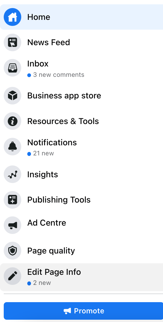
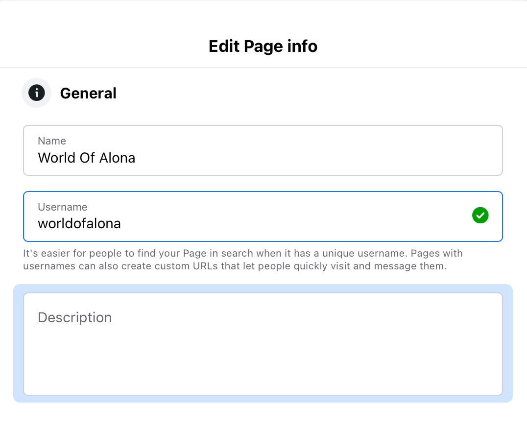
In the ‘Edit Page Info’ section you can customise your page’s About tab. This is where you can elaborate and fill in important information that potential customers will be looking for on your Facebook page.
Call To Action Button
Invite the viewer to take a specific action with a button at the top of your Facebook page. This could encourage the viewer to explore your website, pick up the phone or send your business a message. The key point of the button is to make it easier for your potential customer to access certain actions without having to hunt around for the option. With fewer clicks, they are more likely to take the action without losing interest or getting distracted. As the button is at the top of the page, this makes it really easy to find if the viewer wishes to return to it.
You can set up your page’s call to action through this button at the top right-hand side of your Facebook page.

From here, you have several options. The option you choose will depend heavily on what is relevant to your brand and the action you want to encourage. Whatever you decide to have as the call to action, it’s better to seize the opportunity than to leave it blank.
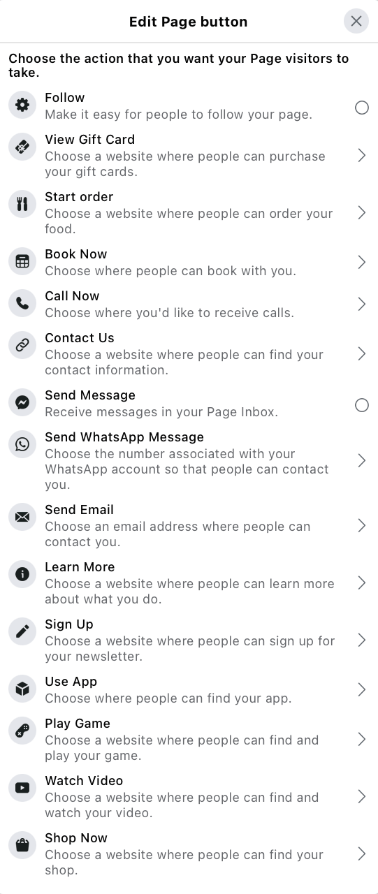
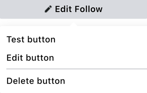
Once you have decided on your call to action and set up the button, make sure you test the button to make sure it does what you’d like it to do. To do this, go to the button and click the button to edit it. Then select ‘Test button’ from the drop-down menu.
Whether you’re starting your Facebook page from scratch or refreshing your page with a revamp, we hope these tips tickle your inspiration. Wherever you are on your social media journey, ensure you are tracking your progress to make the most of your efforts.
Check out Minter.io now →
