Carousel Ad inspiration for your Twitter business

Every business on social media should be utilising multiple features to capture and keep attention in order to grow and generate revenue. Great advertising can re-engage your current audience while inviting new people to join the party. In this article, we’re looking at 5 brands that use carousel ads in clever ways, so you can make sure your Twitter ads stand out in a feed of content.
1. @CellularGoods
Skincare brand @CellularGoods is a relatively new kid on the block. This Twitter account was created less that 2 years ago and has under 10K followers, however that hasn’t stopped this carousel ad capturing my attention. There are several things @CellularGoods is doing oh-so-right.
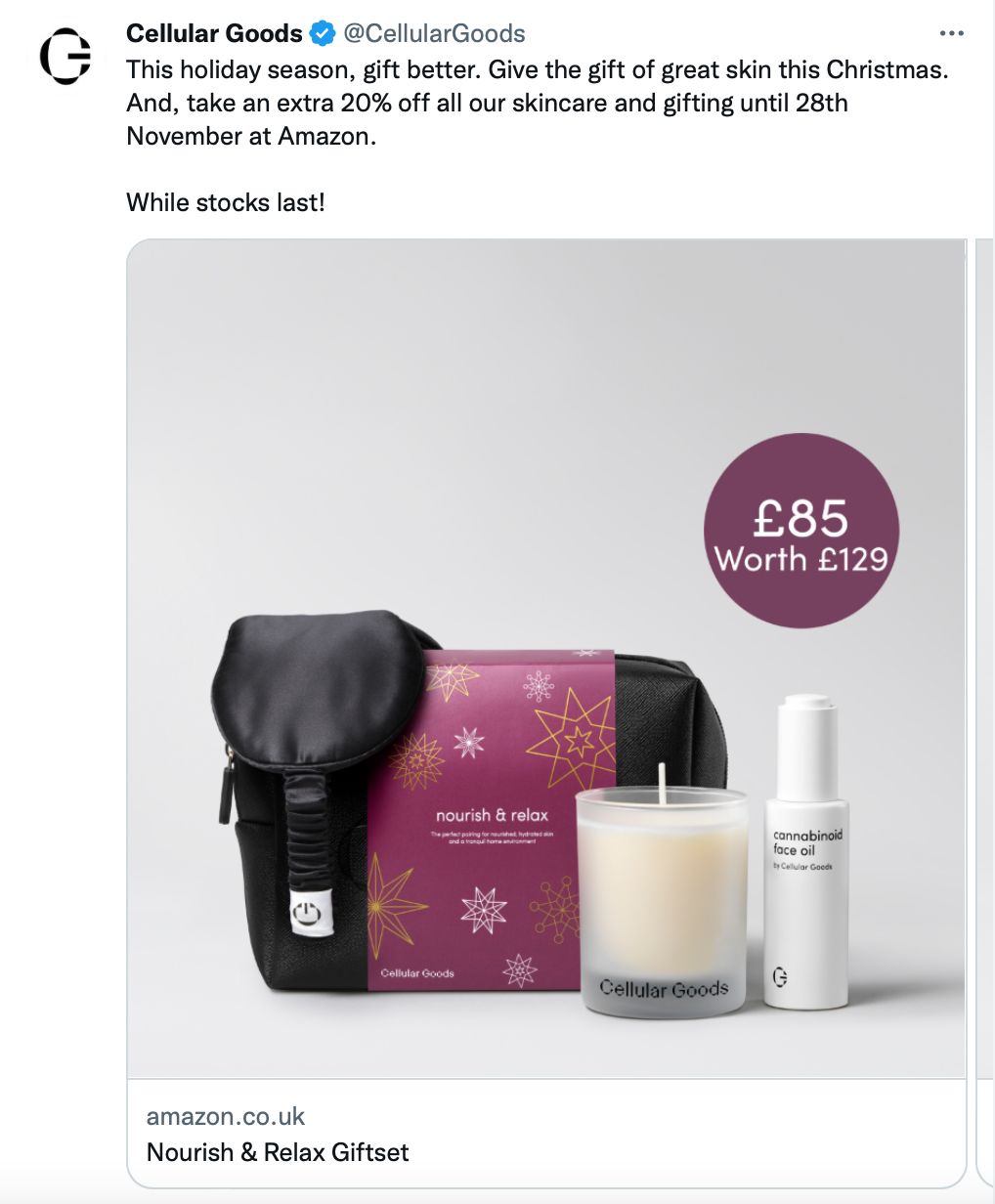
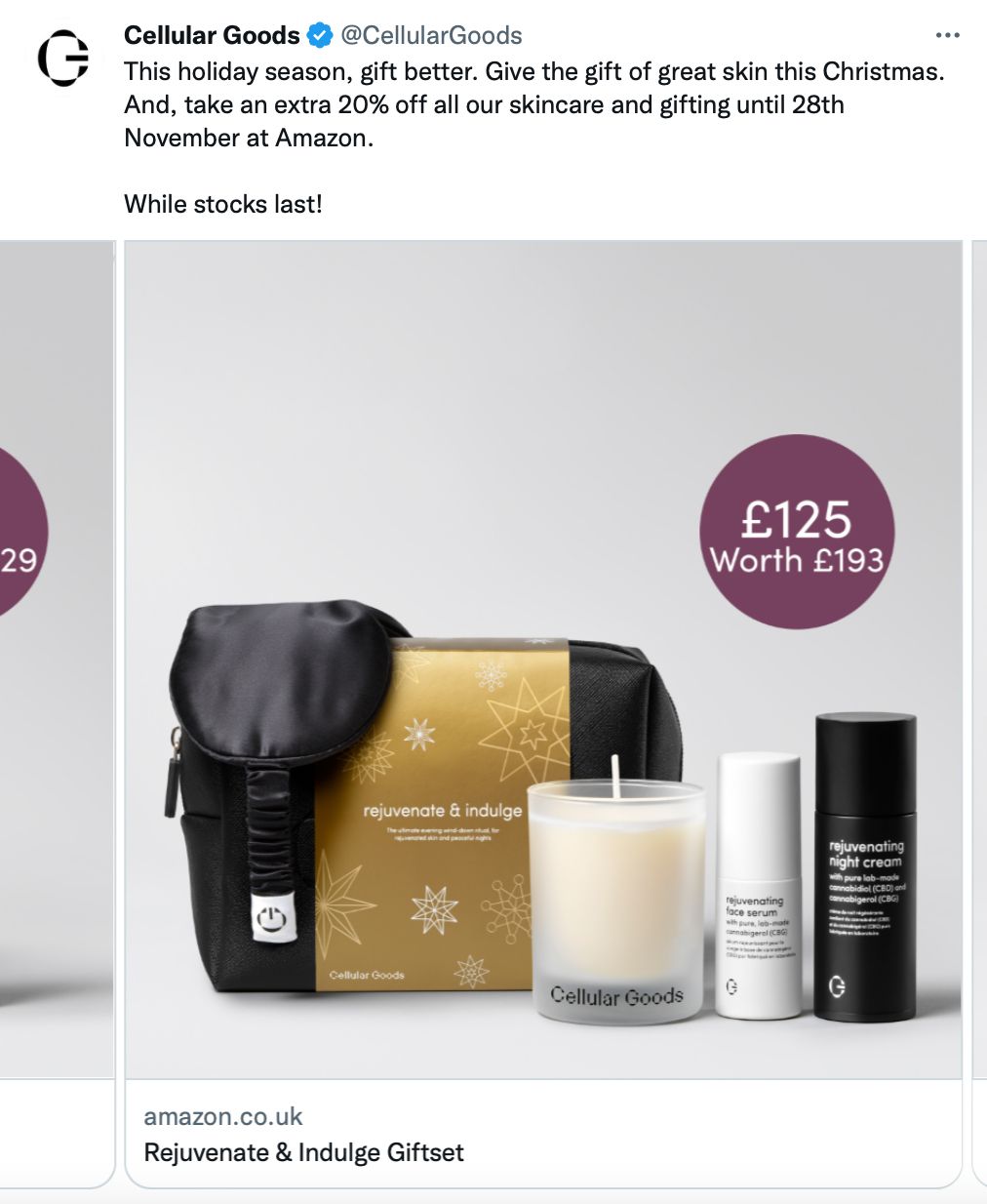
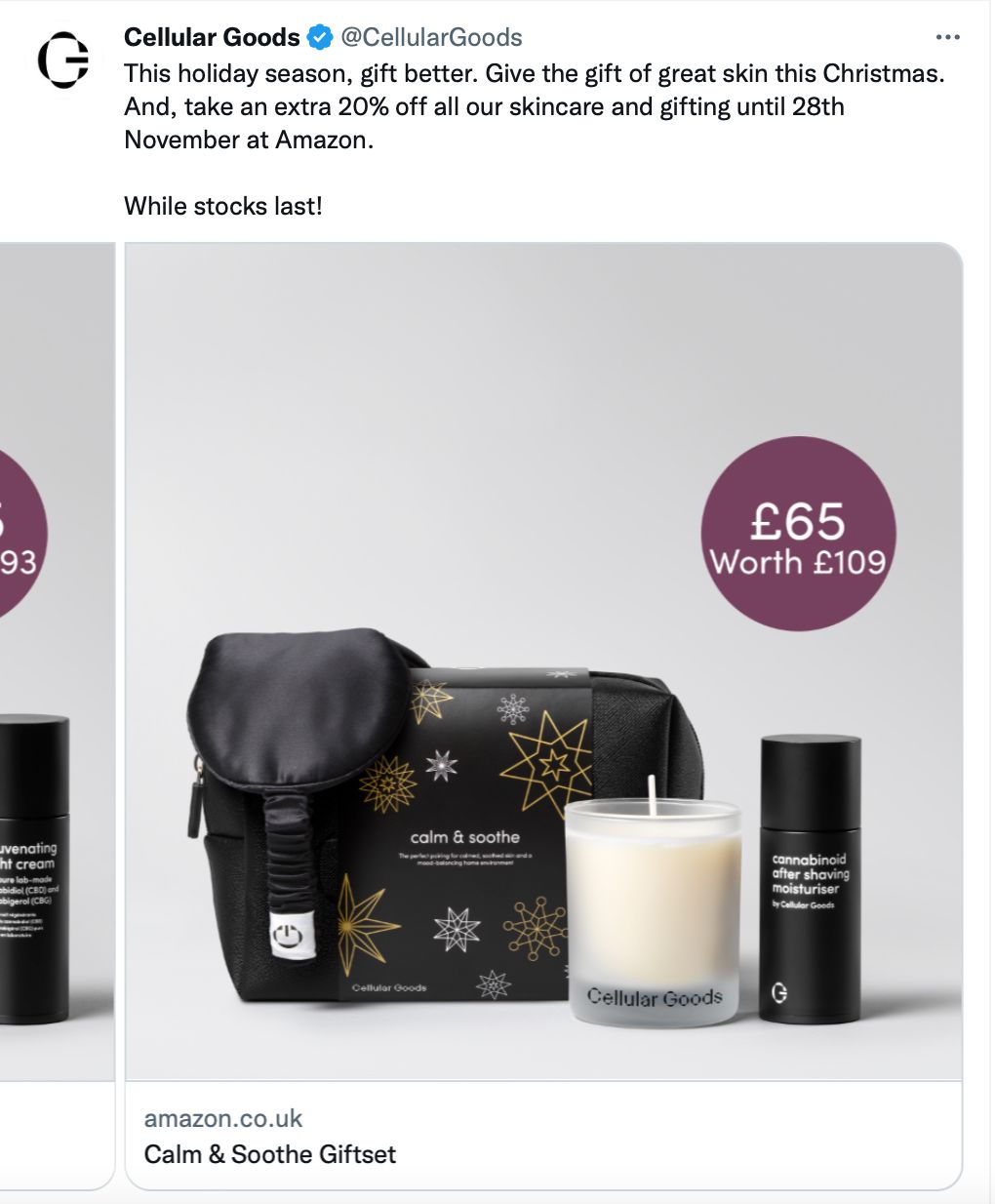
The copy tells any potential reader everything they need to know: the discount percentage, the sale end date and where to find these fabulous products. The use of the word ‘gift’ is repeated multiple times to spark ideas in the reader’s mind. The nod to the holiday season hammers home this motif of present purchasing. There’s even a sneaky ‘While stocks last!’ tagged onto the end. This is used to harness the power of scarcity and invoke FOMO (fear of missing out) in even the savviest of scrollers. This is a clever sales tactic used all over the internet to drive potential buyers to purchase before it’s too late.
The carousel images are extremely cohesive with clear product photos, a clean colour palette and price bubbles added to all 3 images. The simple styling makes the products pop, providing professionalism to the ad and the brand by extension. By pairing those big discounts with the pampering products, any viewer can see what they can get and for a bargain of a price, but only for a limited time. This encourages the click.
2. @on_running
Sports footwear brand @on_running had an ace up its sleeve when it teamed up with tennis superstar Roger Federer. The co-created collection features this famous sportsman, instantly adding recognisability and clout into the campaign.
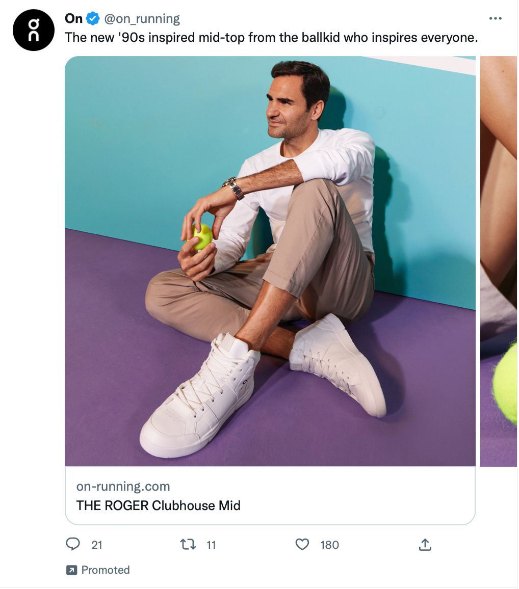
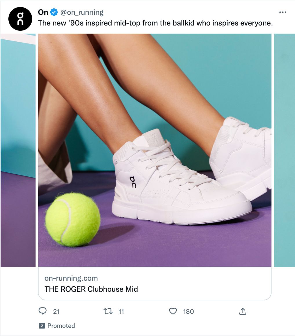
Beyond the famous face, this carousel ad has even more going for it. Notice how the copy includes the words ‘inspired’ and ‘inspires’. The repetition of this key word is used to ignite emotion in the reader. This is how the brand wants customers to feel about its products as well as how a customer should feel while wearing the shoes.
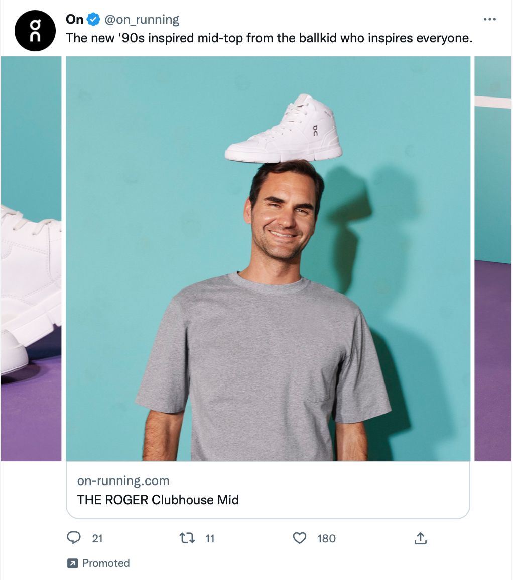
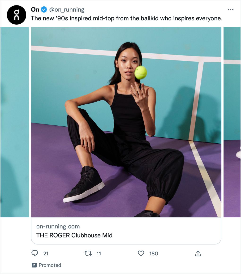
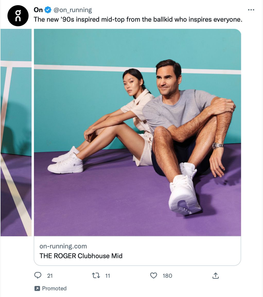
The copy isn’t the only thing that’s inspired. The use of colour in this ad is bright, bold and eye-catching - perfect for grabbing some new eyeballs within a feed. It’s cohesive across the 5 images which are aesthetically pleasing and emotionally charged. The mood shouts professionalism, fun, relaxation, comfort and sporty within every image. Even the photo of the shoe on Federer’s head is incredibly artsy while drawing attention and giving off a whimsical air.
3. @Jaguar
Let’s shift gears with luxury car brand @Jaguar and this stunning 4-image carousel ad. This distinguished brand is dripping in style and this ad whispers excellence.
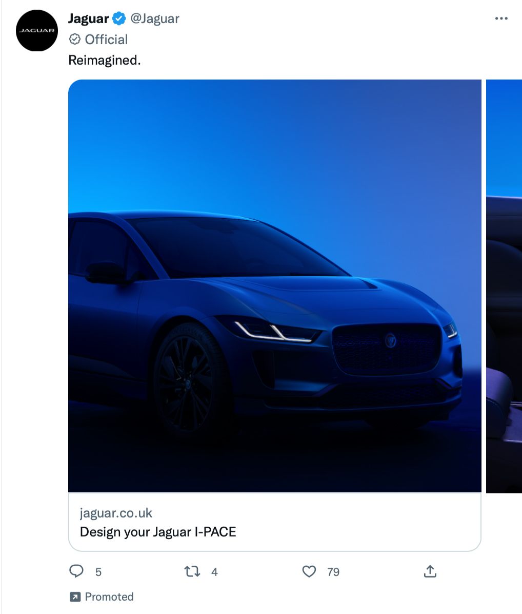
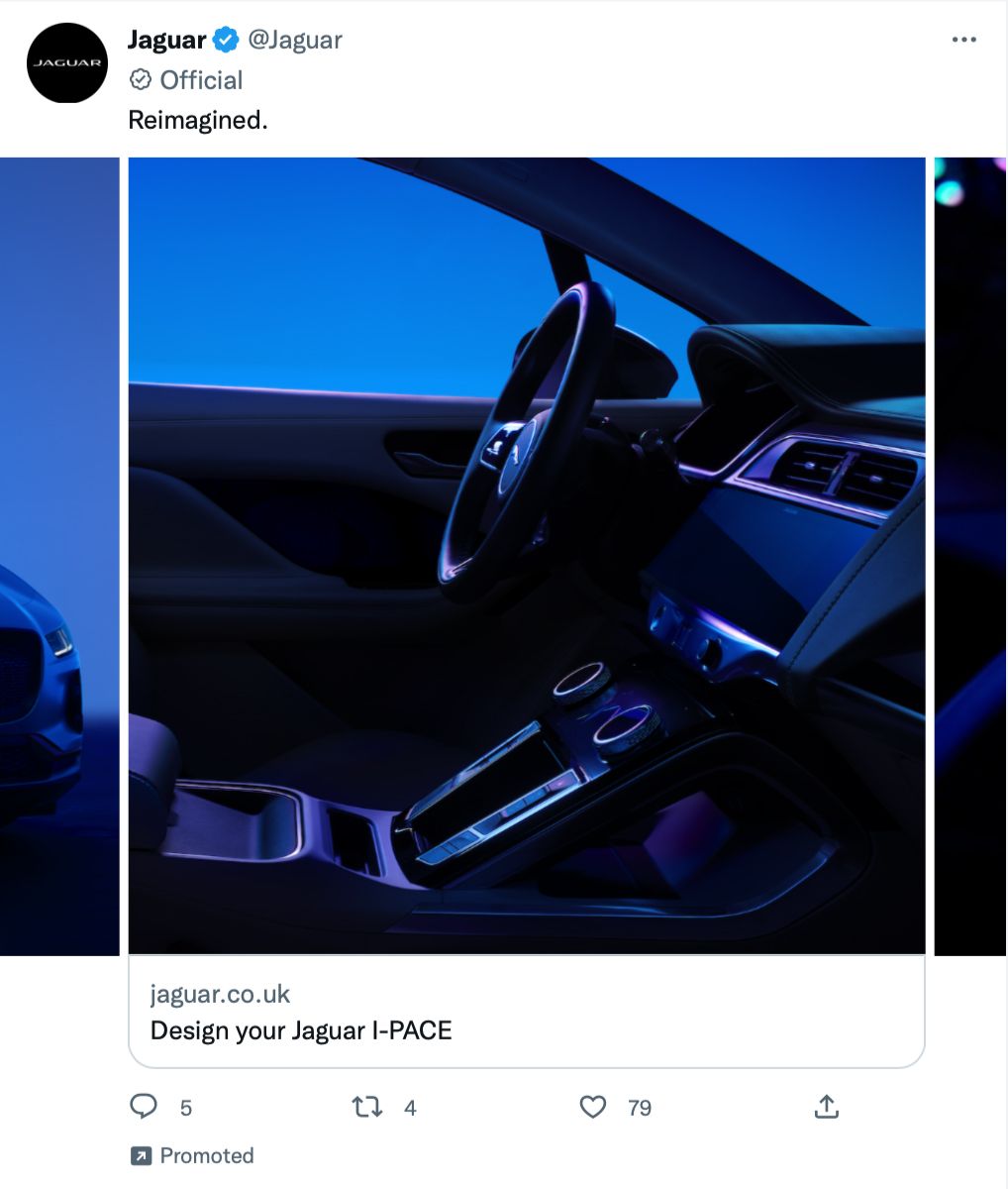
This copy is nothing short of genius. The word ‘Reimagined’ begs for investigation, sparking intrigue and inviting questions from the viewer.
- What’s new?
- What’s different?
- What can I see in the other carousel images?
- Does more await when I click through to the website?
The choice of word is perfection. It gives away just enough to warrant a click without giving away much at all, proving that sometimes one little word is all you need to make a huge statement.
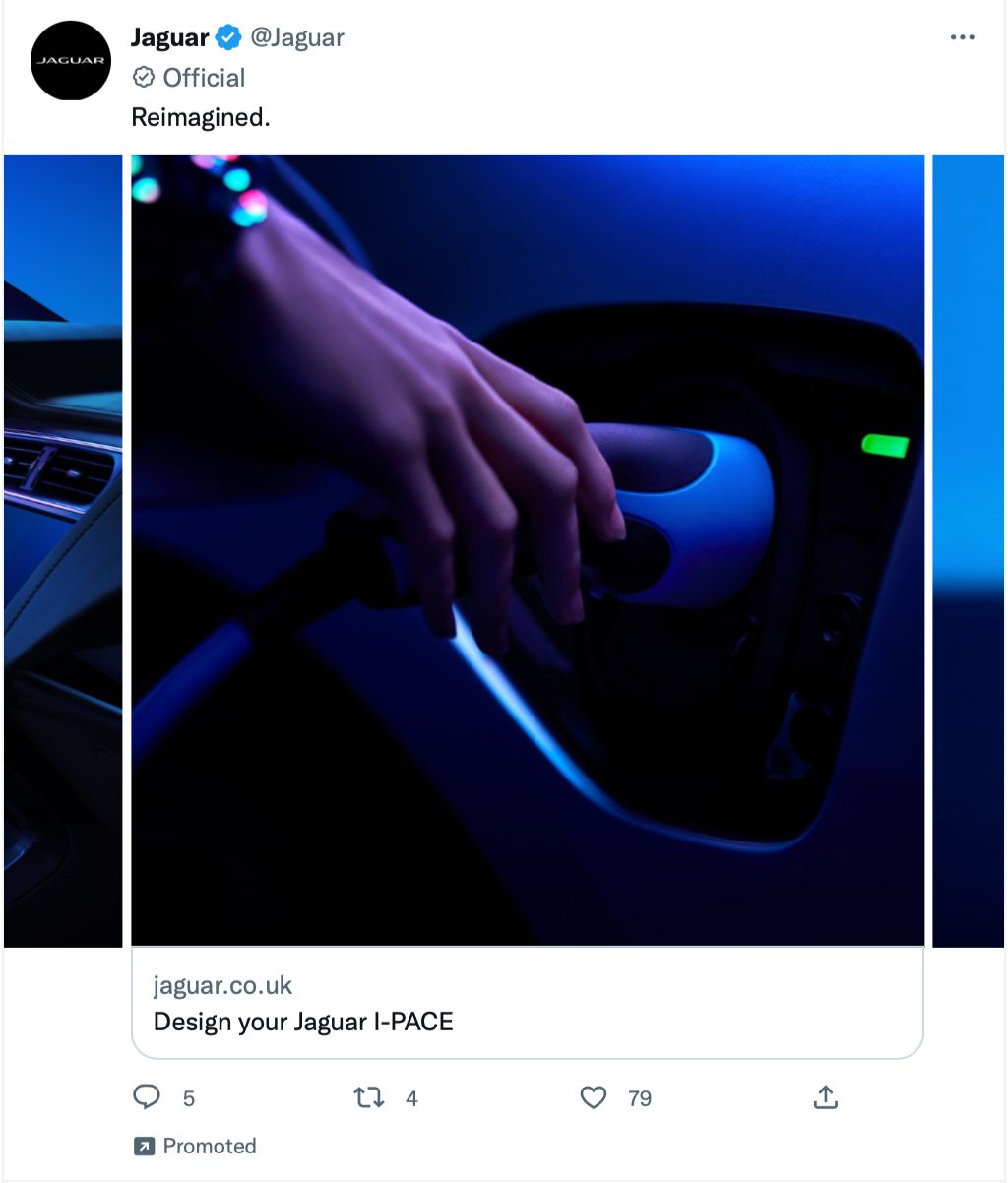
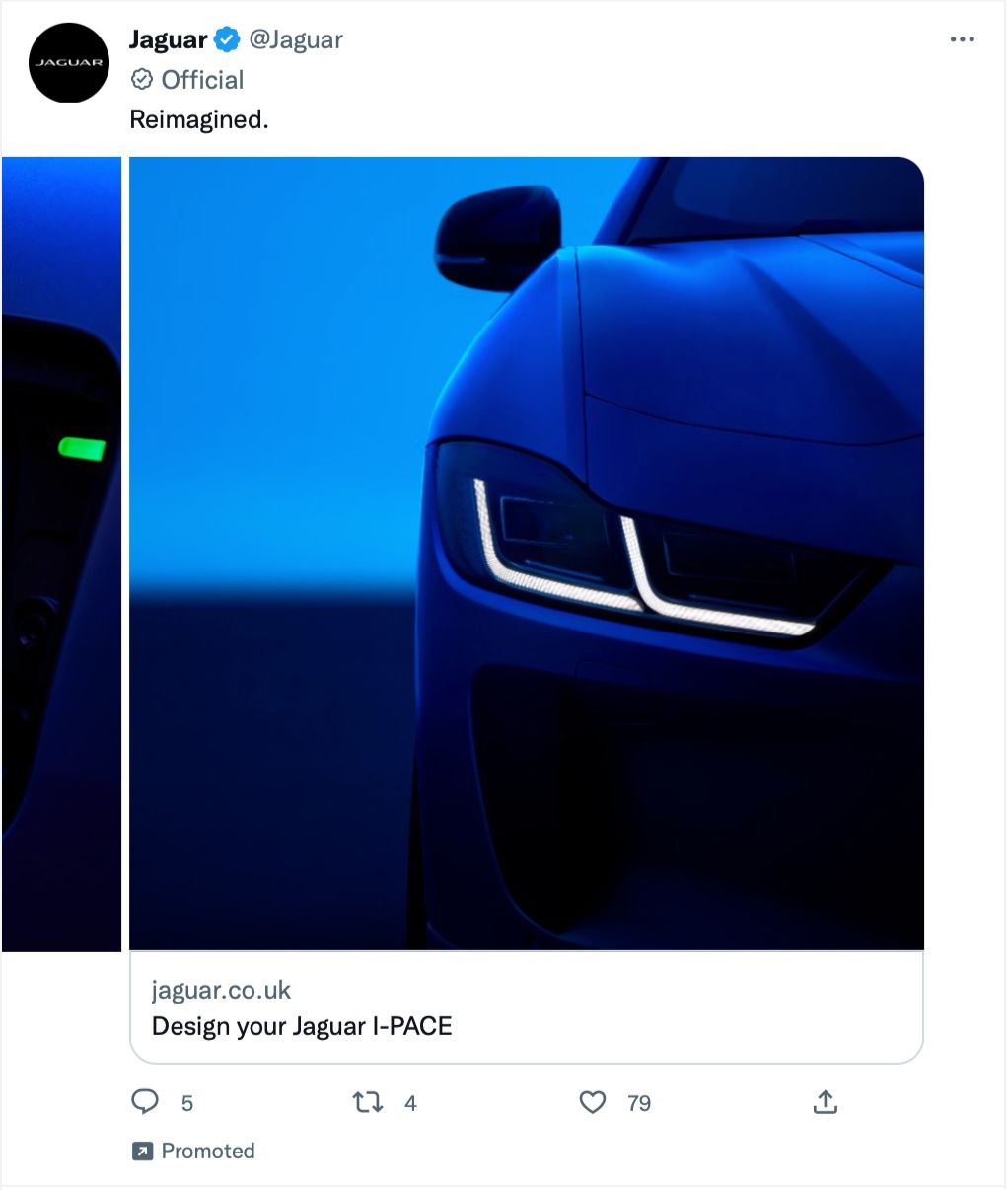
This ad is very different, even within its own niche. Brightly lit car adverts regularly grace our screens, making this dark horse stand out so much more. The obvious parallel I see with this advert is its natural feline counterpart. The dark colours scream mysterious, powerful, beautiful and you can almost hear the engine purr. All 4 images are beautifully artistic, making it easy to assume the vehicle is a work of art too.
4. @WindowsUK
Another brand withholding information is computer brand @WindowsUK in this 4-image carousel. This tech ad might feel pretty standard but there are some sneaky techniques you should totally take note of.
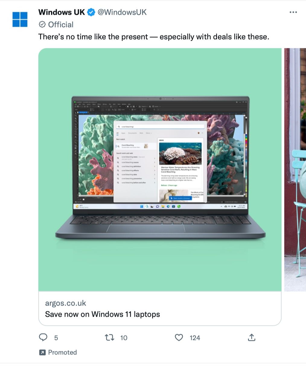
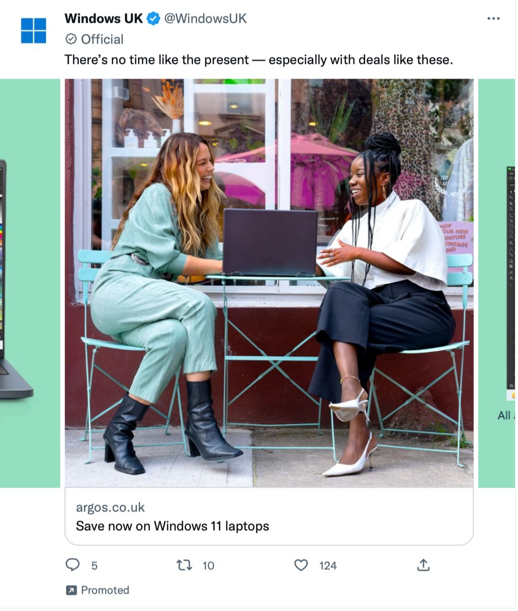
The copy is enough to invite questions without giving away any real information. It forces the viewer to look through the images and click into the ad to find out what the deal is, by which time the viewer has invested time and effort in investigating whether they’re interested in the product. The more time the viewer spends on the ad, the more familiar they get with the product. If the deal is a steal when they click, it'll be difficult to walk away from the purchase because they’ve already invested more time in exploring the product than if all the info was handed to them upfront.
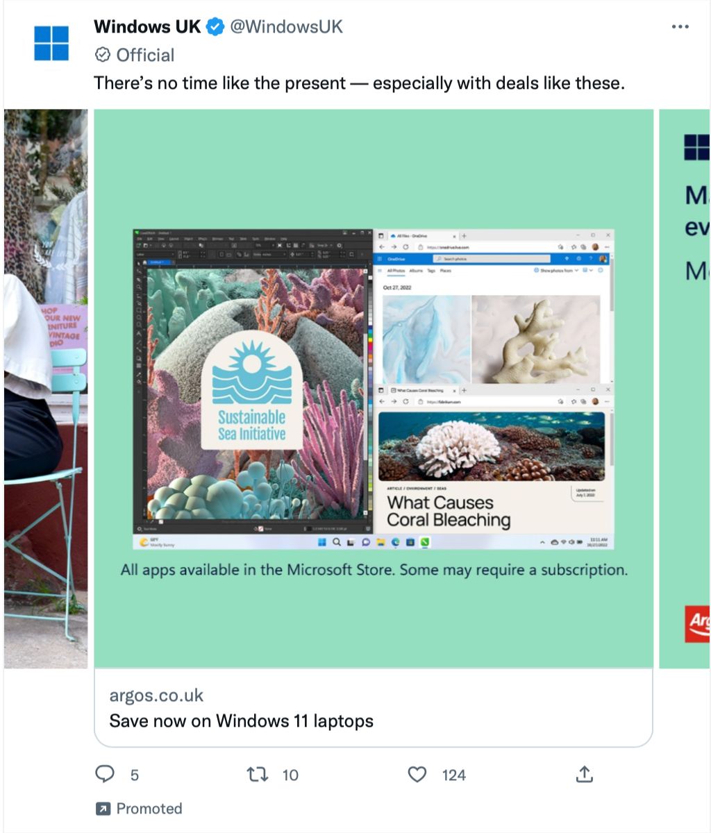
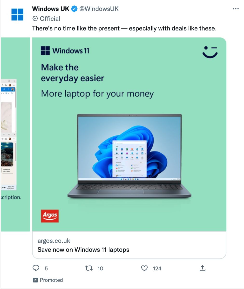
The images also include text but notice how none of the text reveals more information about the deals. All the text does is increase intrigue for the viewer. The images showcase the product clearly as well as how the brand hopes you’ll feel using it. Notice how much the people are smiling in the second image. This image whispers, “This could be you!”
5. @JDOfficial
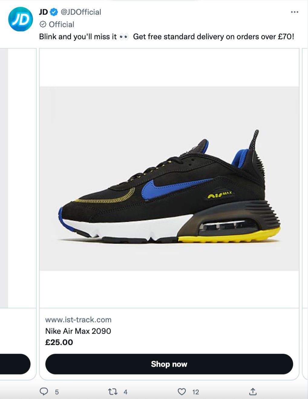
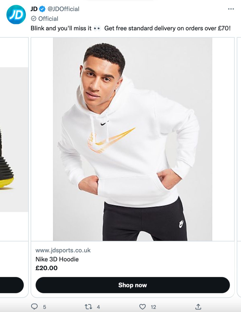
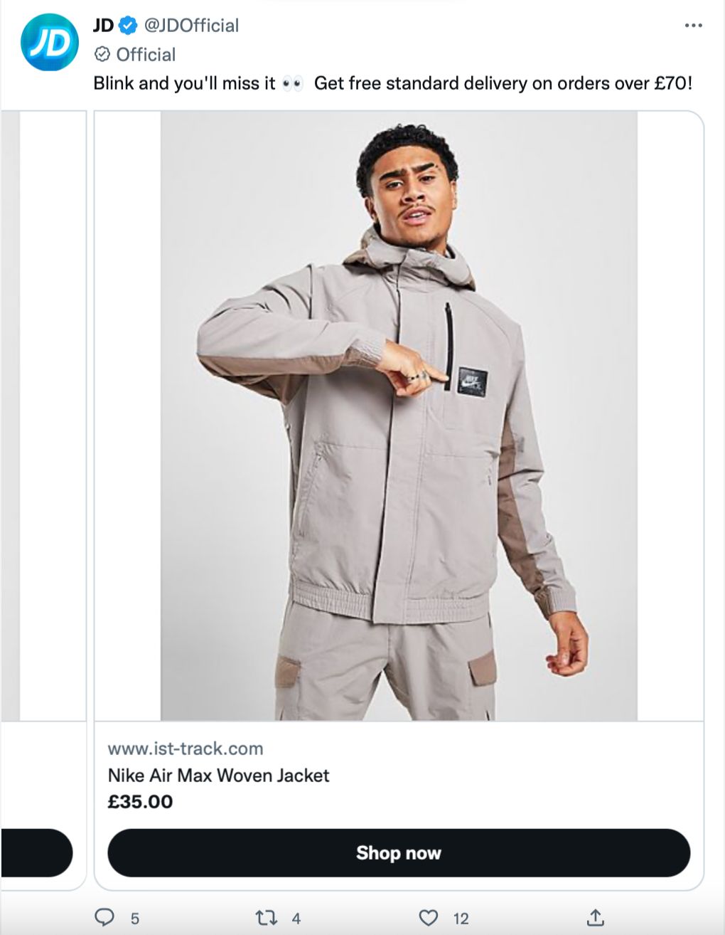
If you’ve got lower priced products, this example might be more suitable for your business. Activewear brand @JDOfficial allows the viewer to scroll through items with the info upfront.
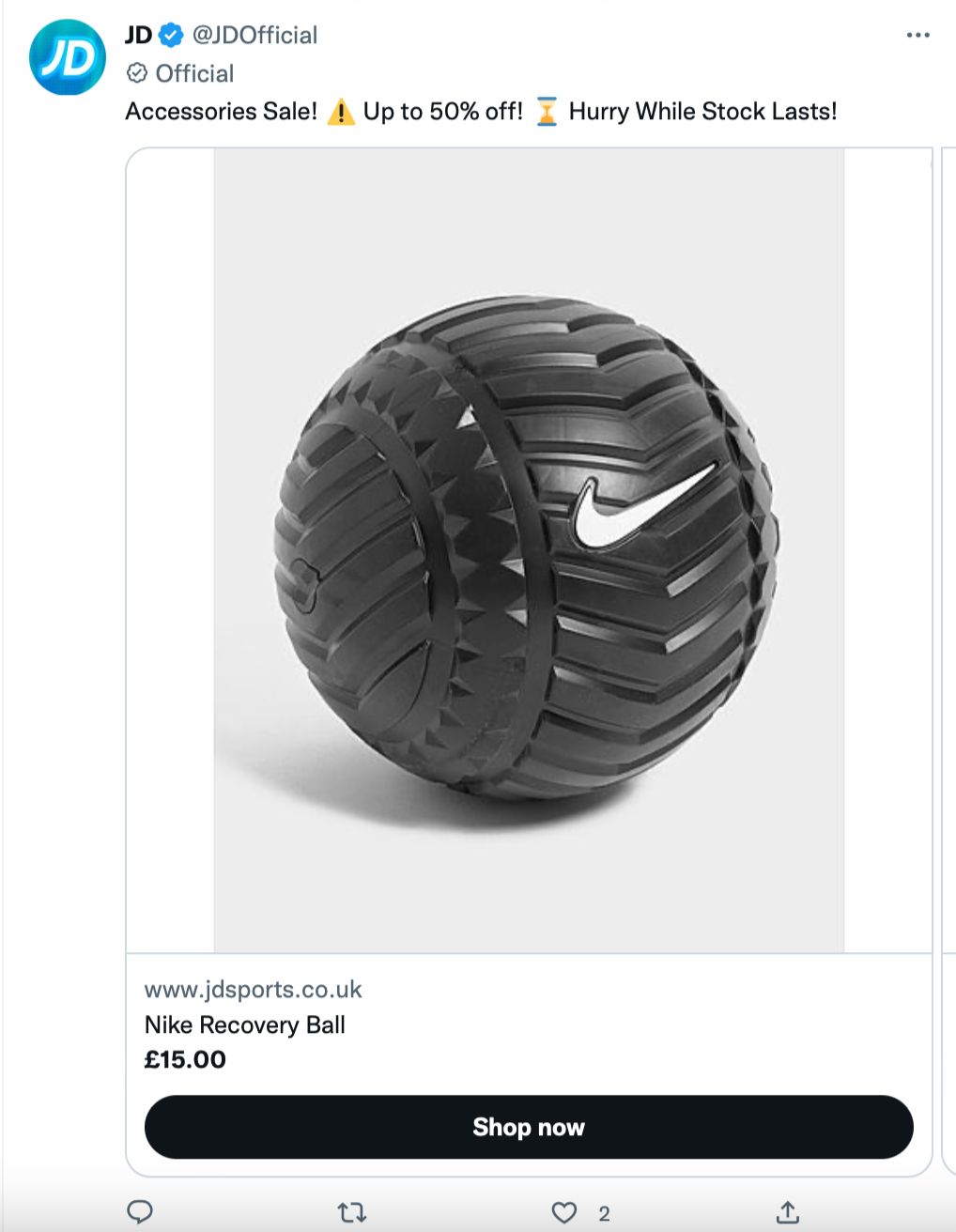
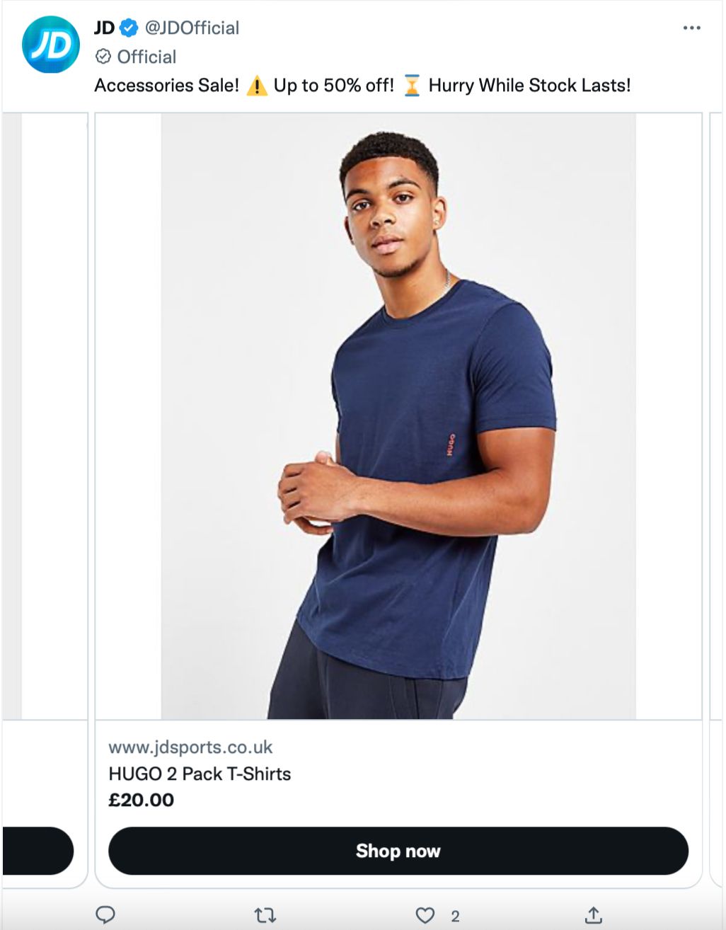
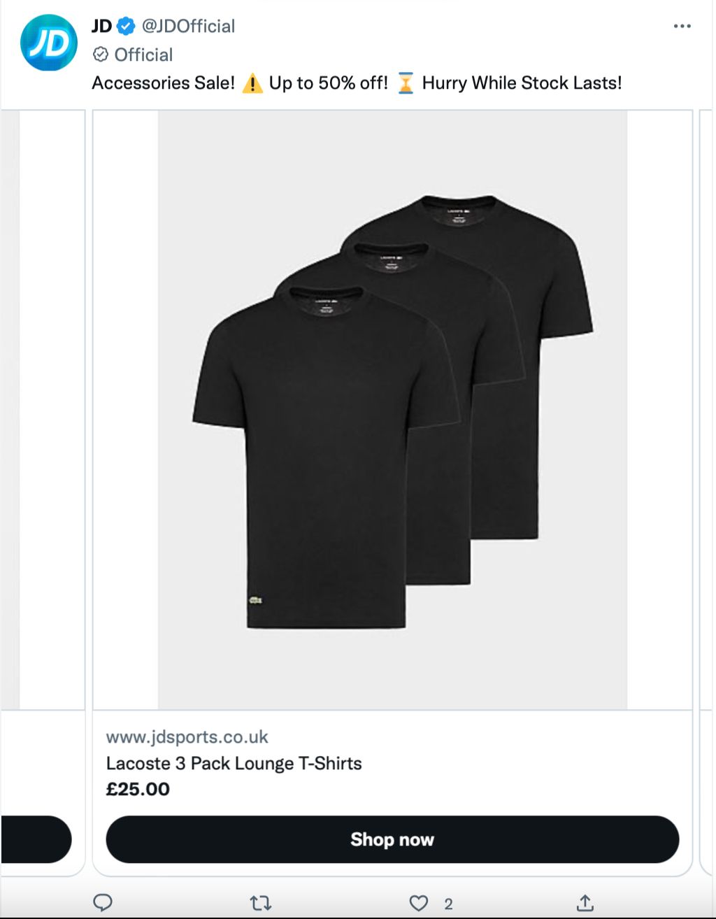
The copy is clear and to the point. There’s a large percentage discount which is enough to grip fans alongside casual ad viewers. The scarcity tactics are in action once more with the words ‘Hurry While Stocks Last’ pushing for a quick buy. There’s also a call-to-action ‘Shop now’ button on each product image. Everything about this ad points to getting quick purchases at low prices.
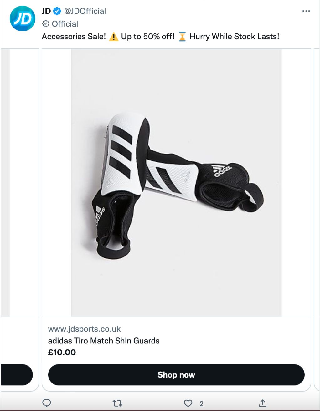
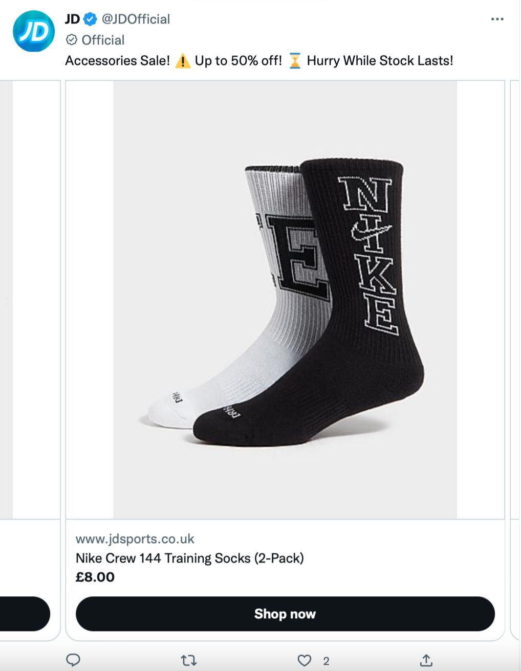
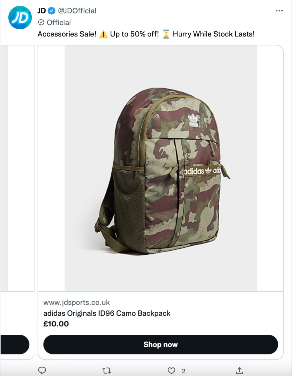
The big takeaway from @JDOfficial is that there are multiple ads running at the same time. This gives viewers more reasons to click. The second ad has a different incentive (this time it’s free standard delivery on orders over £70), so if someone resists the temptation on round one, they might just bite the second time around.
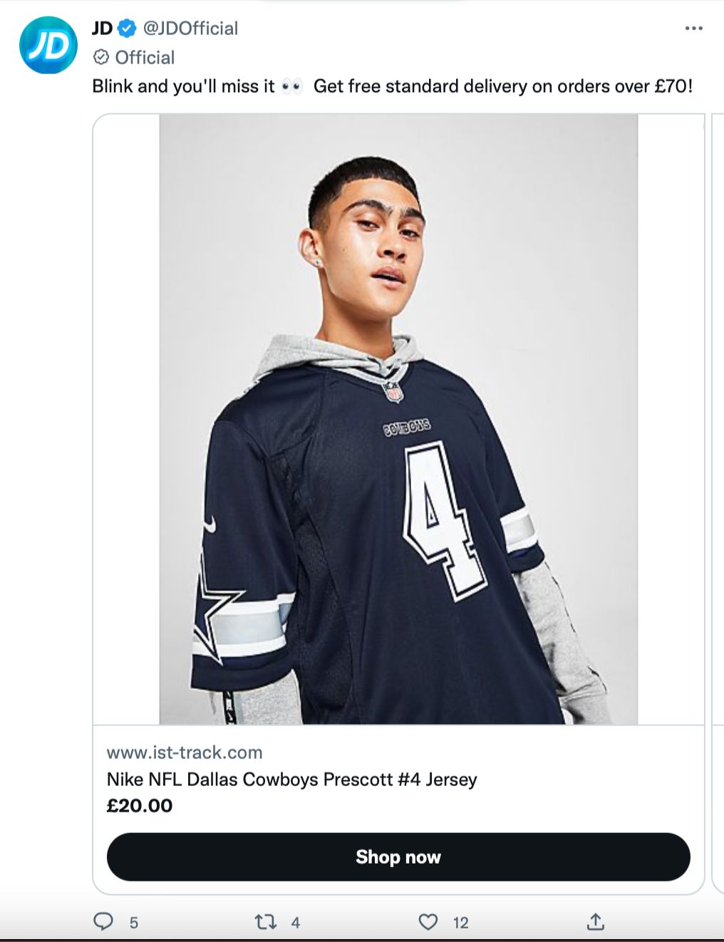
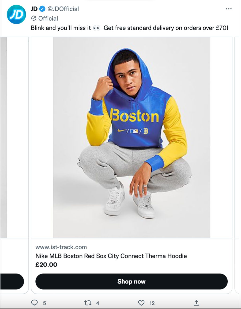
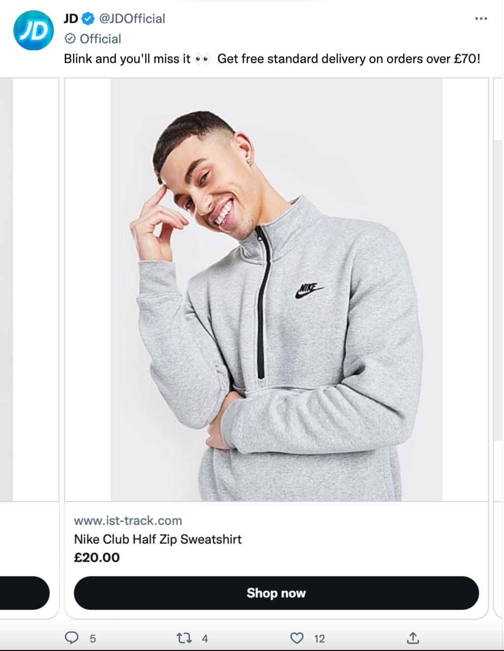
All the same tactics are employed with call-to-action buttons, scarcity text, incentives, prices upfront and clear product images. The branding is cohesive across both ads so it’s easy to recognise and engage with.
Twitter carousel ads are a great way to get more information out to your target audience in one hit. There are several ways to make your ads impactful and we hope these examples spark some inspiration for you. Once you’ve created your Twitter ads, track them with Minter.io - the analytics tool for businesses on social media. Find out more here!
Try Minter.io!→
