6 Powerful Instagram carousel strategies

When one square isn’t enough, say more with Instagram Carousels. This beautiful content feature provides up to 10 slots for images and/or videos on Instagram. Viewers can swipe through multiple pieces of content in one post, so you can share more in a single upload.
Here are 6 powerful ways to get more from your carousel content…
1. Lure in with a list
A cleverly crafted carousel can get viewers to stay on content for an extended period of time and sharing a list is the perfect way to do this. A list feels structured and safe, there are clear expectations and you're rewarded with an enticing dopamine hit for finishing the final slide. It’s very difficult to start reading a list without feeling the natural urge to continue until the end. With this kind of appeal, it’s unsurprising that lists are key components of several successful content strategies.
Another huge reason to embrace list-based carousels is that they work in your favour when considering social media algorithms. A carousel is made up of several slides, meaning this kind of content layout takes more time to view. A list can hook in viewers to scroll through each slide until they reach the final point. Longer amounts of time spent on a piece of content sends positive signals to the algorithm. It essentially tells the algorithm that the viewer is interested in this kind of content, making it much more likely that similar content and content from the same profile will continue to be served up in the feed of the viewer. The more people who spend extended amounts of time on the content, the more valuable the content appears to the algorithm, which can result in a higher amount of reach as the content is placed into more feeds.
Check out a great example of this kind of carousel by @the.holistic.psychologist below. Look at each slide and notice how they are crafted for maximum impact.

The first slide is an incredible piece of work that achieves multiple things:
- It provides social proof - the phrase ‘As a couples therapist’ instantly tells the viewer who the information is coming from and why it should be trusted as a source.
- It sets an expectation - it states the number of points to expect, urging you to get stuck in without uncertainty. It also tells you exactly what information you will learn. There’s no clickbait (or swipe-bait).
- It creates intrigue - the opening sentence elicits questions. It makes you want to know the answers and you have to continue through the carousel to get those answers. There is incentive to explore.
- It appeals to a broad range of people - the text makes it clear who the content is for, but it’s very relatable to a wide range of people. It isn’t targeting a particular gender, location or orientation.
Use the first slide to hook viewers in and give a good reason to swipe through several slides. As the slides unfold, deliver on the opening promise and provide value in every image by sharing new information. This gives more reasons to stay on the content for longer.
There is one extra slide that was included by @the.holistic.psychologist which plays into the Instagram algorithm once more, while providing additional value to the audience.

Posing a question in the final slide and inviting comments gives the audience a voice while boosting engagement for the post. Engagement is another key metric used by the algorithm to determine the content’s ranking. The higher the engagement, the more likely it is that the content will be shown to more people. Make sure to add a similar post to the end of your carousel lists. It is the people most interested in the post that will make it to the end slide so it’s a really good touch for providing value to the audience while supercharging your social media efforts.
2. Piece together the perfect panoramic
If your Instagram is seeping with aesthetic, a beautiful take on a panoramic image can be displayed over several carousel slides. Unlike sharing a panoramic in a single image, placing each part into a new slide allows for a better look at the image without having to fit into Instagram’s ideal dimensions. Each slide seamlessly segues into the other, serving up a smooth solution. Welcome viewers into the scene by sharing a stretched out shot in substantial detail.
This example is shared between the profiles of @swof_ph and @argentinapatago and is made up of 3 slides to complete the entire image.


Instagram carousel shared by @swof_ph and @argentinapatago
3. Maximise your chances of being seen
Due to the nature of carousel posts containing more than one slide, they can appear in an Instagram feed more than once with a different slide offered up each time. This is fantastic news for content that deserves a good chance of being seen, but it’s also incredibly handy when you have something important to share.
This knowledge is evident in this carousel by @thebandghost which shared critical information across two slides.
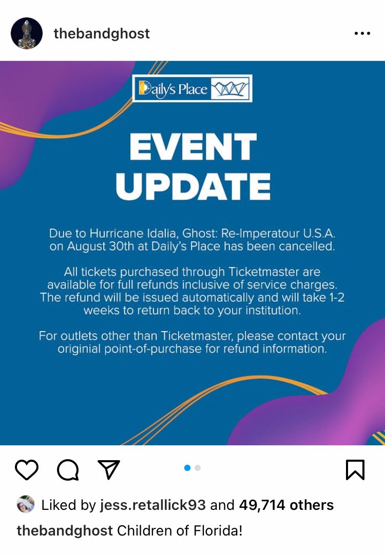

Instagram carousel by @thebandghost
Each slide uses different colours and text to make this post more likely to capture attention, while the carousel format gives this content a better chance of being shown in feeds more than once. Notice that the information on each slide is extremely similar. There is repetition of text and all the major points are written clearly on both slides. This is because this piece of content is all about getting important information out to the people who need to see it.
4. Laser in on the details
Let’s look at some product-centric posts now, as we see how carousels can help you in your quest to get more sales. When it comes to showing off your best stuff, it can be difficult to share it all in a single picture or video. Carousels are a great way to hone in on the details and highlight the best sides.
This sponsored carousel by @lamortclothing is made up of 3 carefully selected images.



Instagram carousel by @lamortclothing
While the initial image is a solid overview of the product, the additional slides provide proof of the quality, attention to detail and intricate design. It’s very telling that @lamortclothing has chosen to highlight the product tag and the label as this shows a level of care and authenticity, helping to build trust with the audience.
How can you use a carousel to inspire trust in your audience? By selecting images that showcase the quality and care that goes into your business, you could achieve similar results.
5. Add multiple slides for multiple products
Carousels aren’t only for organic content. A neat little feature of opting to use a carousel for an Instagram advert is that you can customise the text on each slide. This is exactly what @disturbia did when showcasing multiple products using a carousel post.
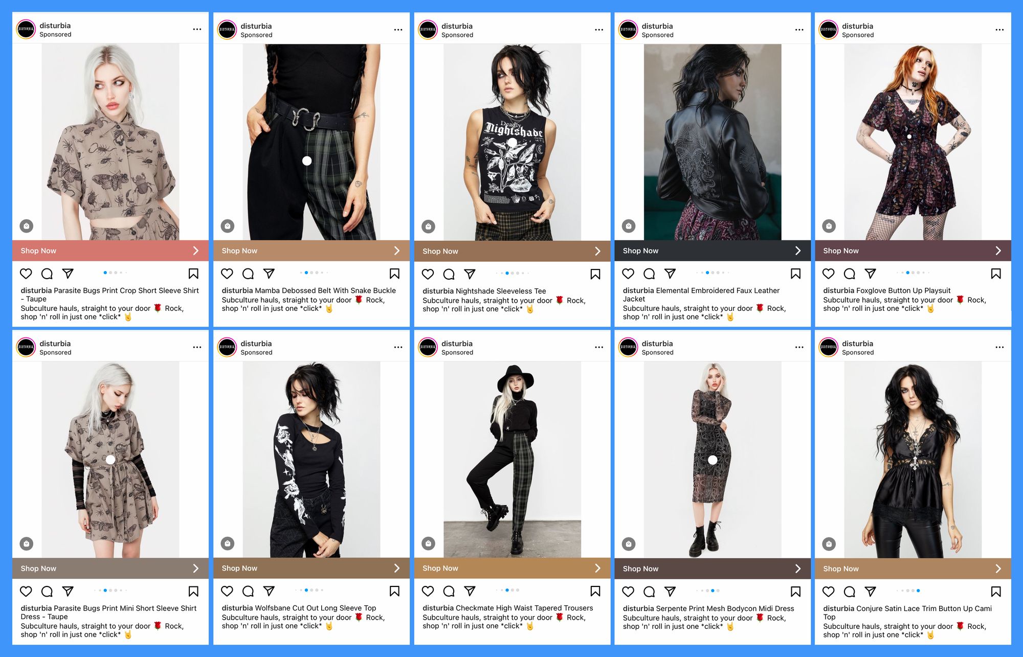
The sheer volume of products showcased in this carousel looks pretty impressive. As potential customers swipe through, it is intuitive to continue swiping to make sure they’re not missing out on something they might love. Once again, this is great for getting people to stay on a post for a long period of time.
Notice that the description changes to identify each product, while maintaining the same call-to-action to inspire sales. This is simple to achieve by changing the copy for each image when creating an ad. Check out this simple guide to get you started.
6. Get all the info across
We’ve seen carousels of text images; we’ve seen carousels entirely of photos. Now it’s time to check out a carousel that packs in both for a multifaceted approach.
This example by @alma_yard has a very specific approach that can be leveraged in multiple situations. It is essentially an organic post that acts as an advert.
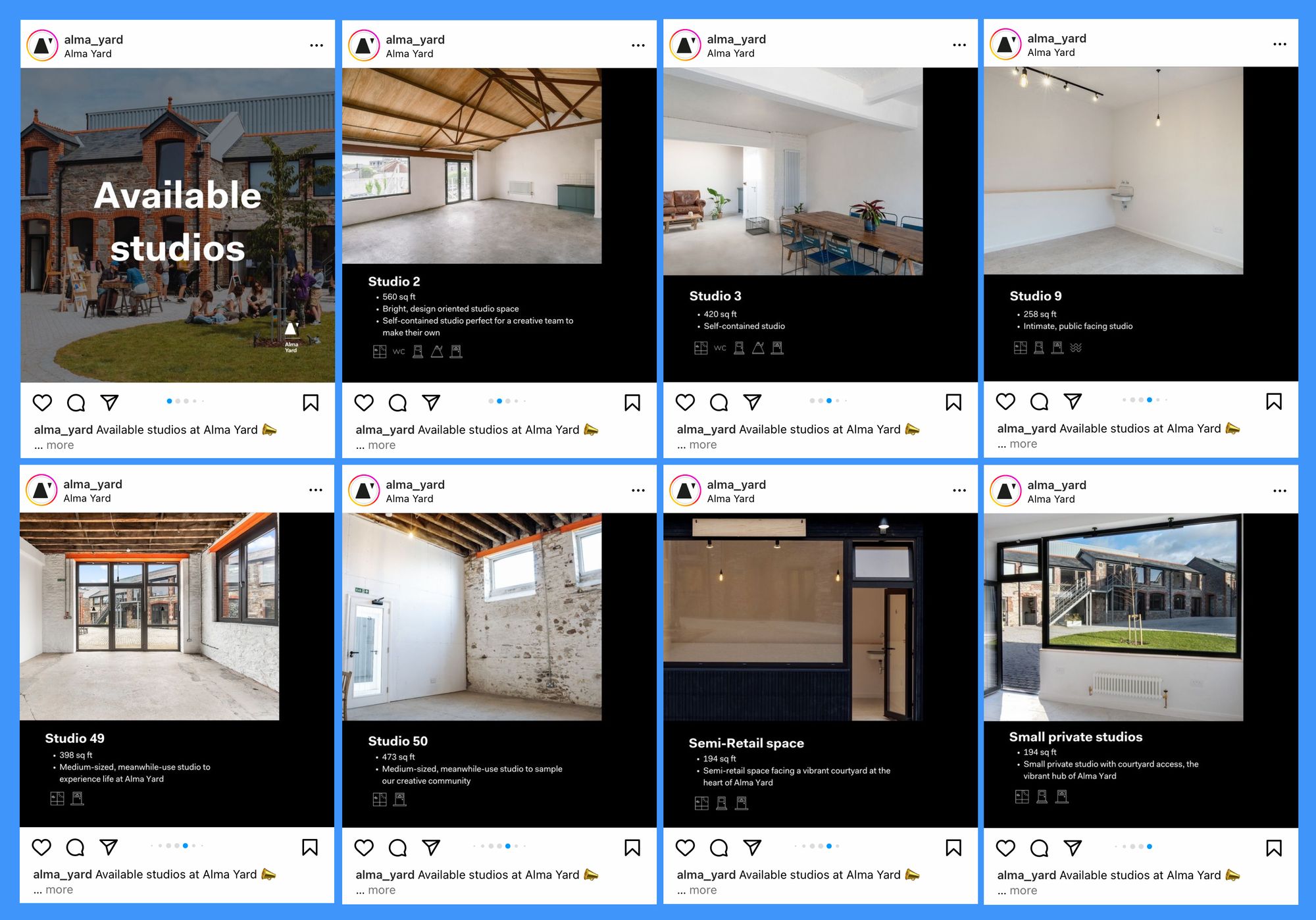
The initial slide tells you exactly who the post is for while the additional slides expand on this. Notice the blending of text, images and design across these slides. They are cohesive and interesting to look at while providing heaps of information for the right viewer.
Due to the nature of the post, interested viewers will likely spend a fair amount of time perusing the images. This carousel also lends itself well to saves and shares, again because of the topic. These are key engagement metrics that boost content performance and make it more likely for a viewer to return to the post, which increases its impressions.
Where might this approach be useful in your business? Are there topics you want to explore through a mixture of images and text? When would this be most useful to your audience?
Over to you! Try out these strategies and see how they impact your Instagram presence by tracking key metrics with Minter.io - the social media analytics tool for every business online. Find out more here!
Try Minter.io now →


