5 ideas to steal for your Instagram ads
We love seeing adverts that combine a multitude of techniques to capture a scroller’s attention, engage the viewer and compel them to take action. That’s why we’ve found 5 completely different examples - with different vibes, products and industries - to show you that whatever your business does, you can make Instagram ads that stand out.
1. Candy Crush Saga
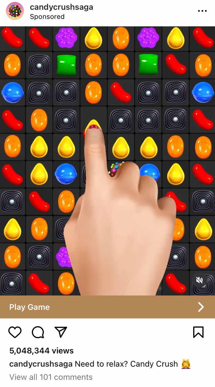
This sponsored post by @candycrushsaga is designed to entice viewers to download a game. Each element of this ad points towards the desired outcome, making it a cohesive collection of ideas ready for you to apply to your own Instagram ads.
Eye-catching media
The visuals of this ad feeds the senses. The game lends itself to catching attention because it uses bright, bold colours and exciting sounds. This ad features simulated gameplay footage, showing the viewer exactly how fun and easy the game is to play.
Simple caption
You’ll find no frills here. This caption cuts straight to the point with a simple one-liner… but it actually contains more value than is obvious at first glance. This caption features a question and a solution, with a single emoji to tie it together. The words ‘Need to relax?’ invites the reader to imagine their stress melting away with the downloading of this game. These words also cast a wide net, as everyone needs to relax at some point. There’s nothing distracting here, just more reasons to download the game.
Button opens download option
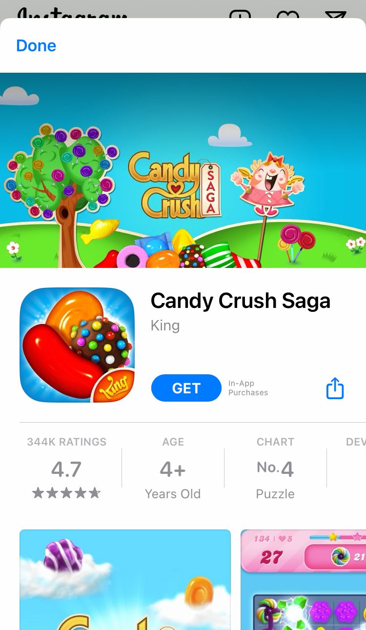
We love the variety of options Instagram and Facebook adverts have for buttons. The ‘Play Game’ button on this ad takes the clicker straight to the App Store to download the game. This direct pathway to the action you want the viewer to take makes it so much easier to achieve your goals without unnecessarily losing potential customers along the way. The fewer amount of clicks between ad and purchase, the better. I guess it also helps that this game is free to download and the button makes that quick and easy to discover.
2. Monzo
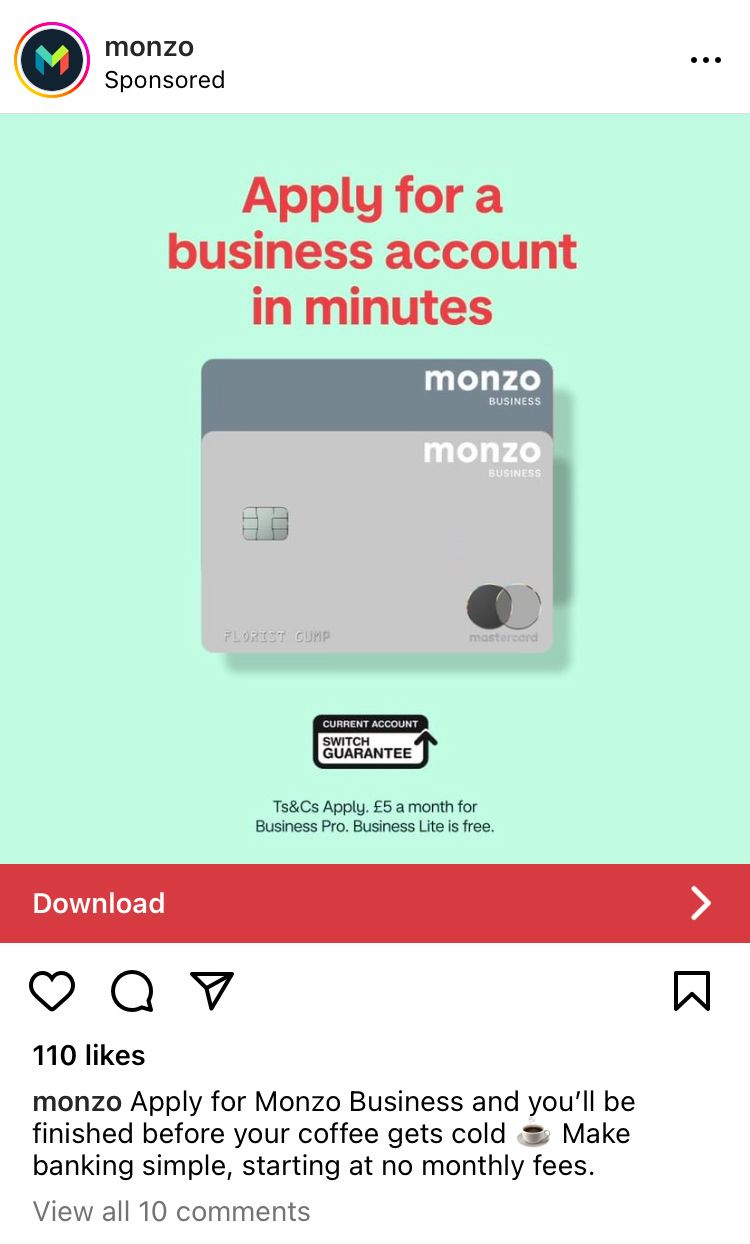
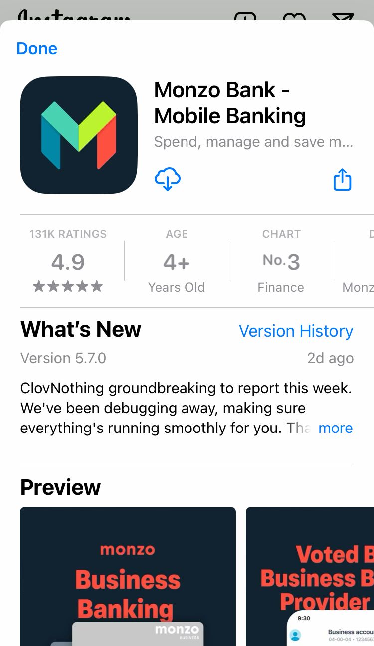
Let’s look at a similar end goal from a contrasting business. This ad by banking company @monzo also seeks app downloads, however the approach is wildly different.
Attracting the right crowd
The media in this ad has a professional, clean, easy vibe which appeals to the target audience. The focus of the imagery is the product on offer, which is shown in a clear way. This clean layout seeks to echo how straightforward and easy it is to bank with this brand, while the choice of contrasting colours is easy to read and catches the eye while scrolling through a newsfeed.
Alleviating problems
The caption appeals to the needs of the right clientele for this product. Business owners often don’t have time for unnecessarily complicated, time-consuming tasks. This caption addresses these concerns. There’s also the mention of no monthly fees, which answers a question viewers might have straight off the bat.
Professional button
This example takes the viewer directly to the App Store to download the app… but look at how the text differs from the previous example. It’s professional and it does what it says. This is a perfect example of how two completely different companies can have the same goal while tailoring their approach to their own target audience.
3. Rheal Superfoods
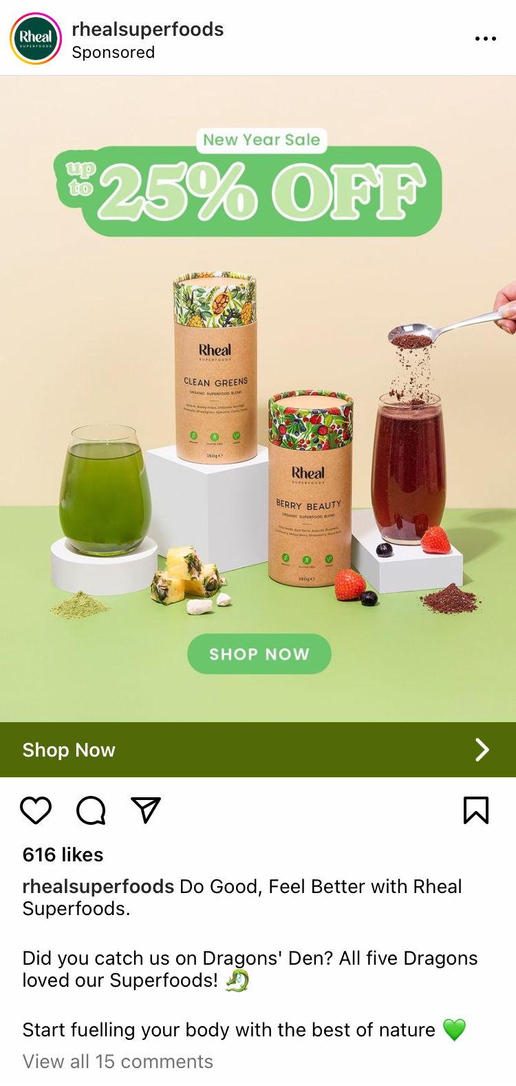
Another classic goal for Instagram ads is to drive traffic to a company website and this is exactly what @rhealsuperfoods did. This brilliant ad has so many elements we haven’t covered yet so strap in for a good one…
Cohesive media
The imagery in the ad aligns with the colours and fonts synonymous with this brand. It includes two different products in contrasting colours, suggesting that this isn’t a one-trick-pony… there may be even more to discover. To top it off, there’s an offer up for grabs. If the gorgeous products and packaging along with the cohesive branding weren’t enough, maybe a good wedge off the purchase price might twist the viewer’s buying arm.
Compelling copy
This caption features copy that resembles that of a food blogger, with each line separated for easy reading and green emojis nodding to the branding once more. The viewer is told what they can expect for themselves with phrases like ‘do good, feel better’ and ‘start fuelling your body’. The viewer is also told what they can expect from the brand with the phrase ‘the best of nature’.
Notice the mention of Dragons’ Den? This is social proof in action. It aims to provide credibility for the brand through ties with trusted, well-know authoritative figures with expertise. This big name drop aims to rub some trust onto the advertising brand.
Land in the right place
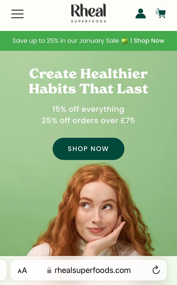
The ‘Shop Now’ button brings clickers to the business website and @rhealsuperfoods has nailed this landing page. The website is cohesive with the messaging of the advert alongside consistent branding, colours, emoji use etc. so the viewer knows they’re in the right place. It’s professional, reiterates the sale percentage and provides more reasons to buy. It almost feels like an extension of the ad, instead of the other way around, making new potential buyers feel confident to purchase.
4. Smile Direct Club
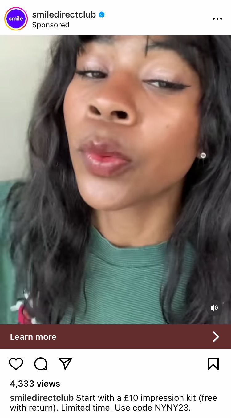
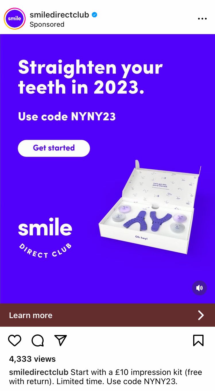
Teeth straightening brand @smiledirectclub has a system set up which is seen a little less regularly on the Instagram ad scene. It combines many more elements than we’ve touched upon so far.
Mixed media
This ad features a video with multiple elements to it. Firstly it shows people sharing their experience of the brand.
This provides:
- Instant connection through people talking to the audience
- Trust through perceived reviews of the product
- Relatability through a human connection
- Answers to concerns and questions the viewer might have
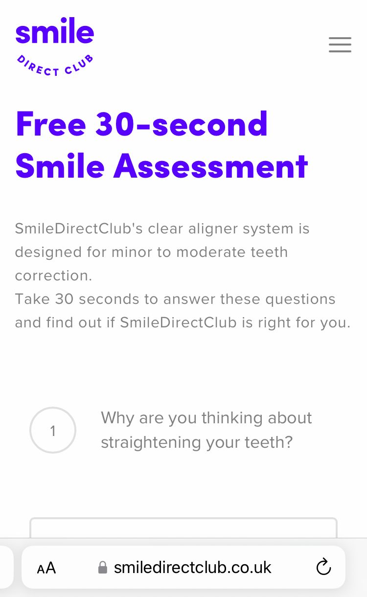
Then the video shows a person going through a quiz. This sets the viewer up to know what to expect if they wish to click on the call-to-action button. Lastly, there is text and product imagery on the screen, featuring the brand colours and a code. This info correlates with the ad copy.
Each element serves a specific purpose and when put together, this ad provides a huge amount of information in a short amount of time. This can spark intrigue, address concerns and answer questions for the viewer.
Unspecified offer
Notice how vague the copy is. The code makes the viewer feel like they’re getting a special offer, while the text doesn't specify what the code does. There’s also the phrase ‘limited time’ which is a scarcity tactic. This is used by brands to make the viewer feel like the offer is in short supply and must be snapped up. The time is unspecified, creating a sense of urgency in the viewer. When used responsibly, these types of tactics can help brands grow while providing plenty of value to the customer.
Quick quiz
The button takes the viewer to a specific webpage where there’s a quiz for the potential customer to take. This quiz is also talked about and shown in the ad, so the viewer expects it and knows how it works. By taking the viewer directly to the quiz, there’s no extra buttons to press and places to get distracted by, resulting in the desired outcome for the advertiser.
5. Godhead Coffee
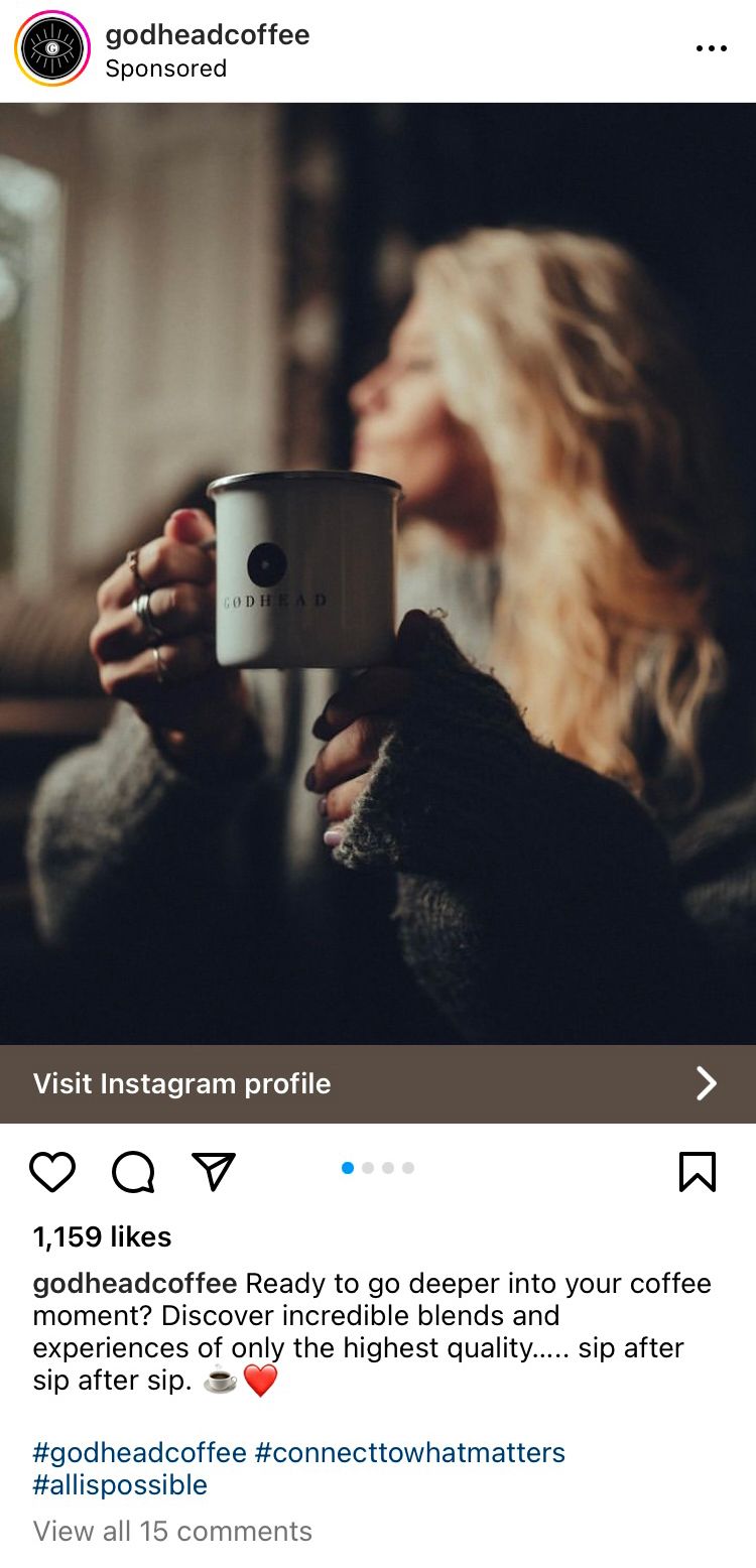
Perhaps you just want to build your audience on Instagram? Easy peasy. Coffee brand @godheadcoffee created an ad in the simplest of ways to boost its presence on Instagram.
Boosted post
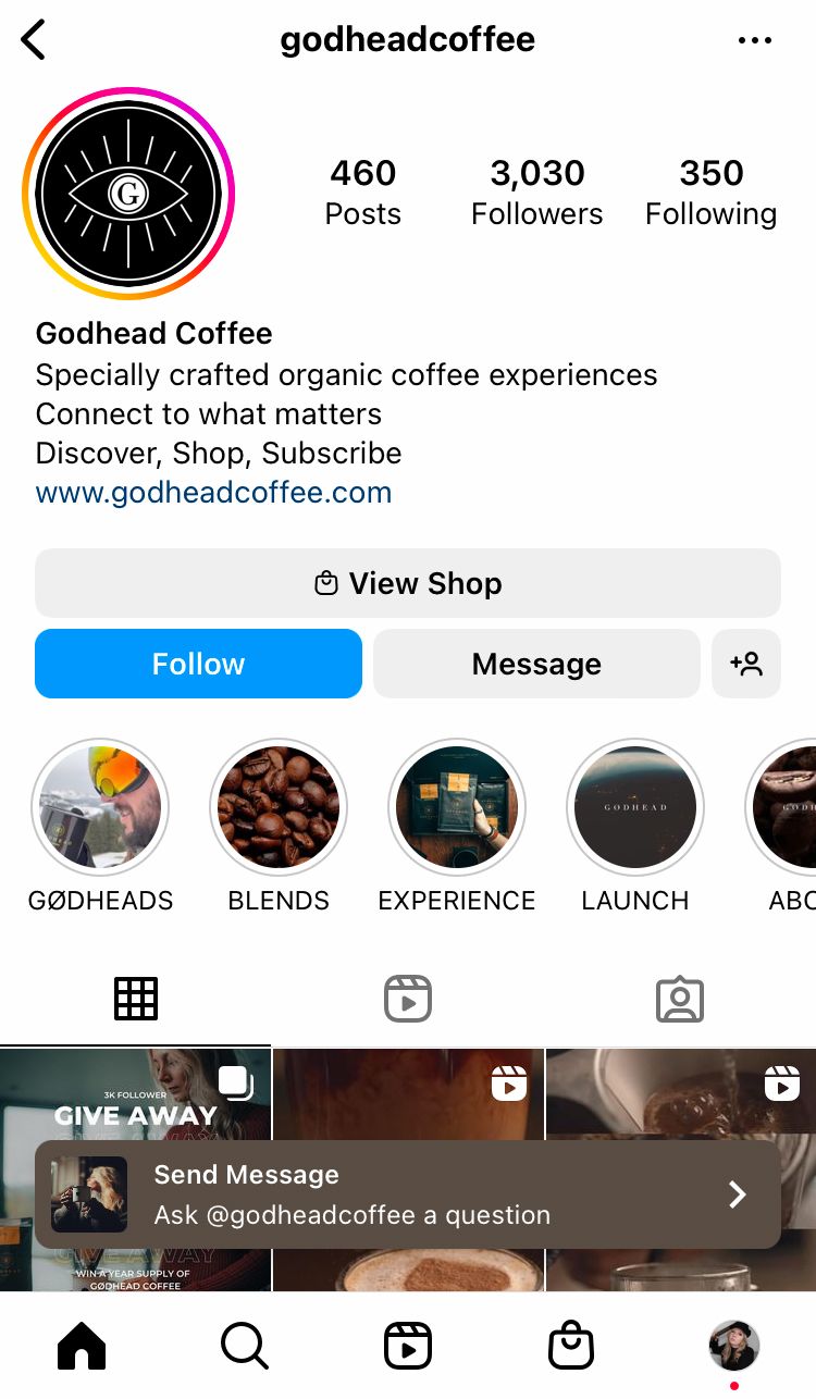
We found this post was also a regular post on the @godheadcoffee profile, so this sponsored ad is actually a boosted post. Boosting a post directly on Instagram is the easiest way to get started with ads on the platform and this ad shows how powerful boosting a post can be. The instagrammable imagery fits seamlessly into a feed. It invites the viewer into the picture as the subject because the focus is on the coffee, not the person. The person in this photo is out of focus, allowing the viewer to step into the image and imagine it’s their own quiet moment with a hot cup of yum.
Unpolished caption
The caption is very much as you’d expect from a regular Instagram post, complete with hashtags. This makes the ad feel authentic. It could fit in anywhere, it just happens to be from a brand.
Open the door to your world
The button in this ad takes the viewer to the brand’s Instagram page, which invites the viewer to fall in love with the brand of their own accord. In a way, it showcases one image, before allowing the viewer to discover so many more pieces of content at the touch of a button. This doesn’t feel like an advert pushing a product; it feels like a friend inviting you in from the cold.
Sponsored posts are a great way of reaching new, relevant people with your brand. When you create your next advert, make sure you think about the elements that go together to create your most powerful Instagram ad yet.
Ask yourself:
- What is the desired outcome?
- What am I trying to get my audience to do?
- How can my imagery capture attention?
- How can the copy support the end goal?
- Will my ad appeal to my target audience?
- What does my ideal customer care about?
- What are the fears/hopes/problems of my target audience?
- What button will serve the purpose of my ad?
- Where should my button lead the viewer?
- Is my ad cohesive?
- Does my ad reflect my brand?
We hope you can suck a lot of power out of these dynamic examples. Don’t forget, to get even more out of your experience on social media, sign up to Minter.io today. This analytics tool provides metrics and data to help you make your best content yet. Check it out now.
Try Minter.io→

